Progress Overview report
 Updated
The Progress Overview report is closely related to Overviews - Attainment but, as its name suggests, it deals with progress over time rather than attainment at a single point. In many ways it is similar to a Progress Matrix in that it shows the change in pupils' assessments between two points, but rather than show a detailed breakdown, this report provides a summary and is therefore well suited to audiences such as governors.
In this guide you will learn how to:
- Start the report
- Fix the start and end points
- Set the 'Expected Progress' rate
- Select different subjects and types of assessment
- Apply filters and groups
- Show data for the whole school
What do we mean by 'Expected Progress'?
The report uses the terms 'Below Expected', 'Expected Progress', and 'Above Expected' to describe pupils' journey between two points. Before we move on, it is therefore worth defining what these terms mean in the context of this report; and this depends on the approach your school has taken:
- If your school is using a levels-style or "linear" approach, then 'Expected Progress' may be defined as a certain number of points or steps gained over the selected period. Pupils making less than that number of points are defined as making 'Below Expected' progress; pupils making more than that number are defined as making 'Above Expected' progress. This can apply to your teacher assessments and/or linear assessment schemes such as Book Bands.
- If your school has adopted a "point in time" assessment approach, where pupils tend to remain in the same assessment band for long periods or even throughout their time at school, then 'Expected Progress' will indicate that there has been no change in assessment over the selected period. Pupils that drop down an assessment band are described as having made 'Below Expected' progress; those that move up a band have made 'Above Expected' progress.
This distinction is important as it affects how the report is set up. In this report we will be dealing with the latter example as this is the most popular set up in Insight.
Creating a report
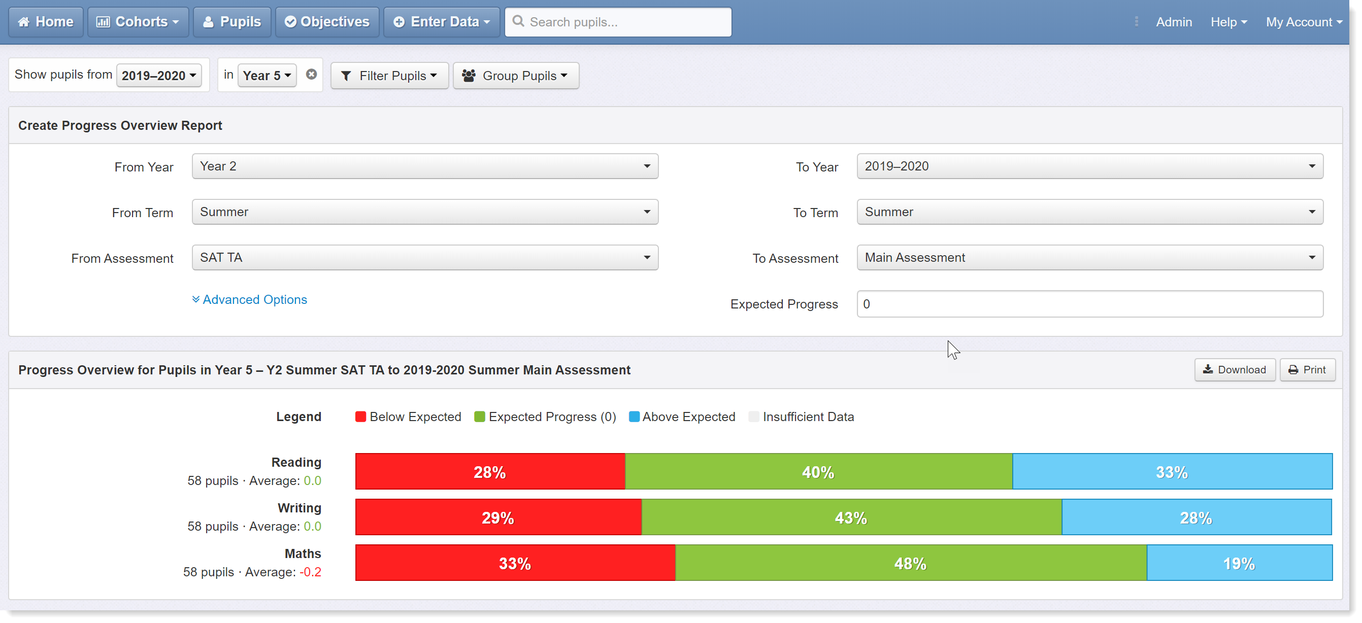
First, click on the Reports menu and select Overviews - Progress from the list. This will load the report for the most recent pupil groups you have been investigating for the current term, with Reading, Writing and Maths displayed. Here we're looking at year 5.
Now let's set the parameters for our report using the drop-down menus. A simple example is to look at the progress between the end of last year and the end of the current year. To do this, change the start point to the previous year using the From Year menu. As we are using teacher assessment (our 'Main Assessment') for this report and interested in progress between Summer terms, we don't need to change the other options right now.
We do, however, need to set the expected progress rate. As this school is using the 'point in time' assessment approach described above, this equates to no change in assessment over time. This will be defined by entering a 0 in the Expected Progress box (highlighted). If you have a steps-based approach, enter your expected rate of progress instead.
The red segments of the bar contain those pupils whose assessments have dropped, the green segment contains those that have maintained the previous standard, and the blue segment contains those whose assessments have improved.Click on the bars to reveal pupil names in each segment.
Click on the bars to reveal pupil names in each segment.
Exploring the data
Insight's filtering and grouping options allow you to define which pupils you want to include and how you want to compare them. These are accessed via the Filter Pupils and Group Pupils buttons at the top of the screen.
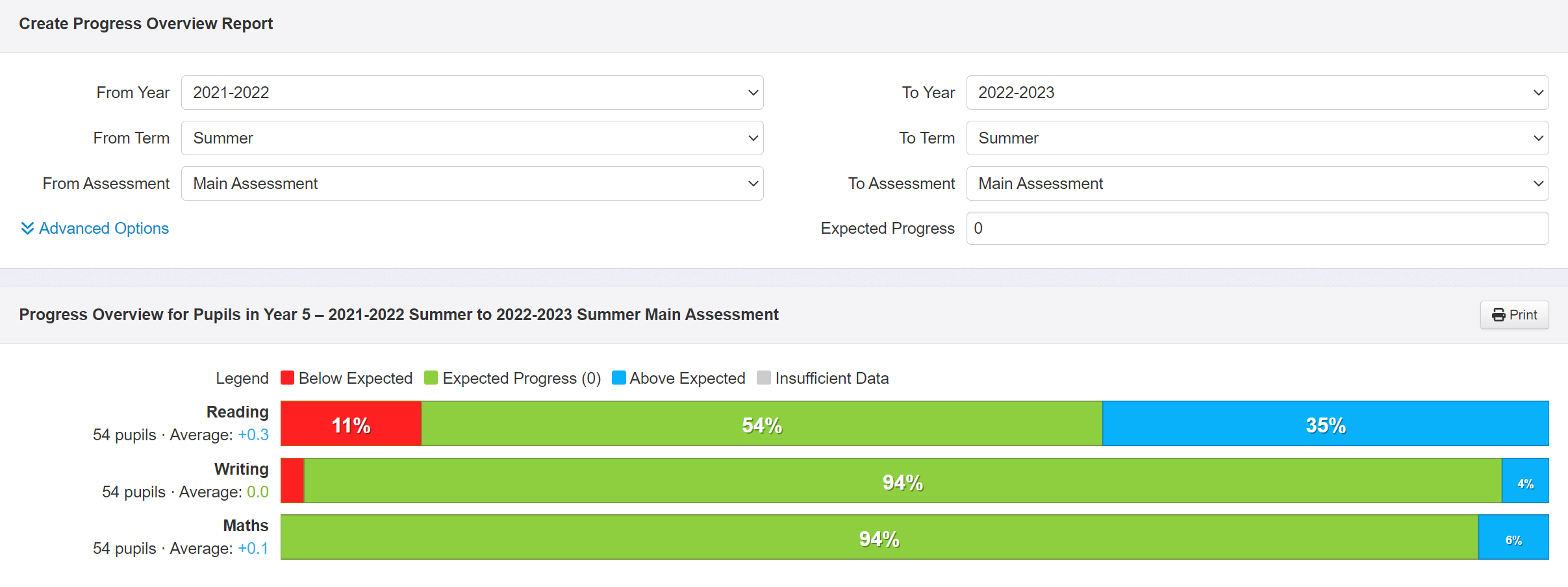
Now let's try filtering the report and comparing groups of pupils. We might want to remove pupils with SEND from the report. To do this, click on the Filter Pupils button, choose SEND and select No SEN. The report now contains only those pupils without SEND.
The next step is to group the data; here I've grouped it by gender. Click on the Group Pupils button and select Gender. Our report now shows the progress of non-SEND boys and girls in Year 5 between the end of last year and this year.
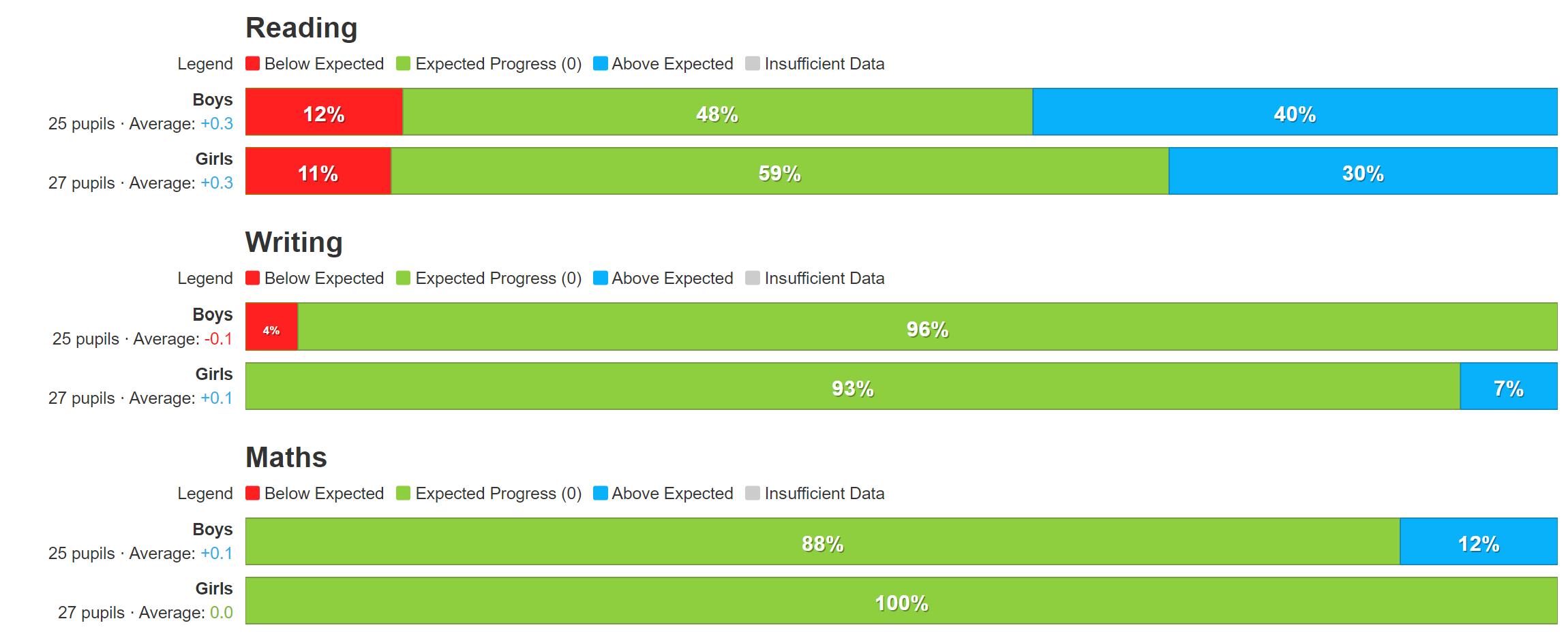
If you're using the Trust version of the report, you will have the option to group by School.
Mixing assessment types
In this next example, we are going to compare pupils' KS1 result to their latest assessment. This means having different types of assessment selected at either end, in this case the KS1 result (named 'SAT TA' in Insight) compared to a teacher assessment (i.e. 'Main Assessment').
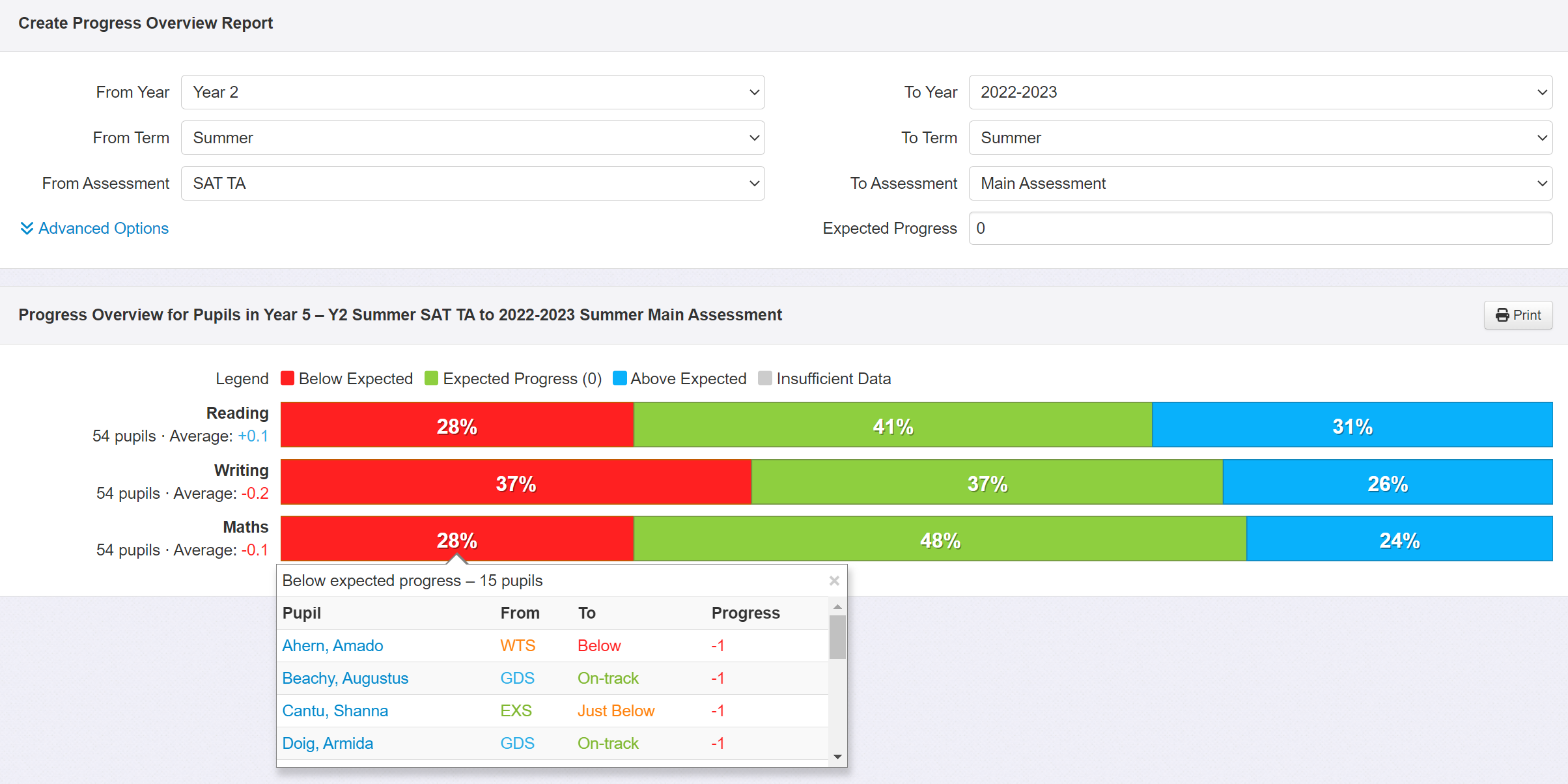
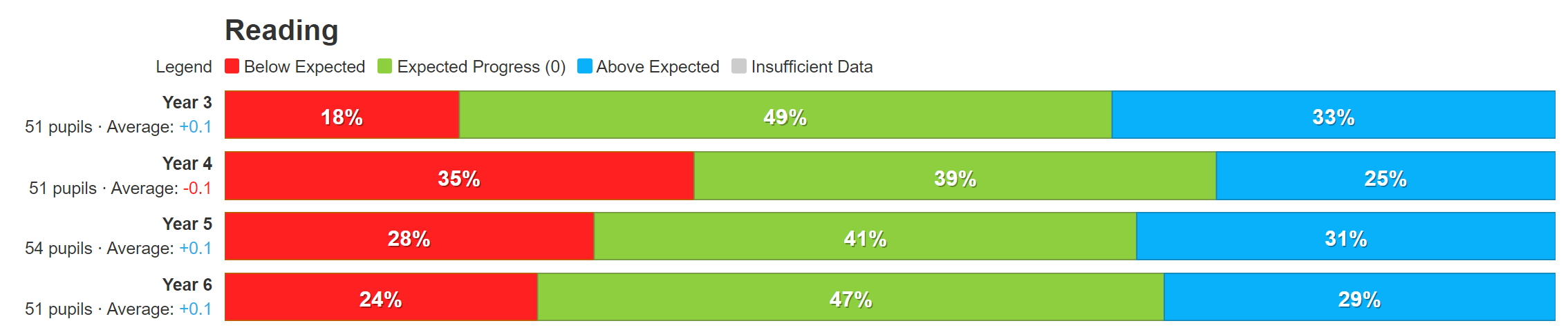
The end point is unchanged but the start point is now set to 'Year 2' and 'SAT TA' (i.e. the KS1 result of current year 5). As you can see, approximately a third of pupils' assessments have dropped since KS1. Clicking on the red segment of the Maths bar reveals the pupils whose assessments have, for example, dropped from 'EXS' to 'Just Below' and from 'GDS' to 'On-track'.
Selecting more than one year group
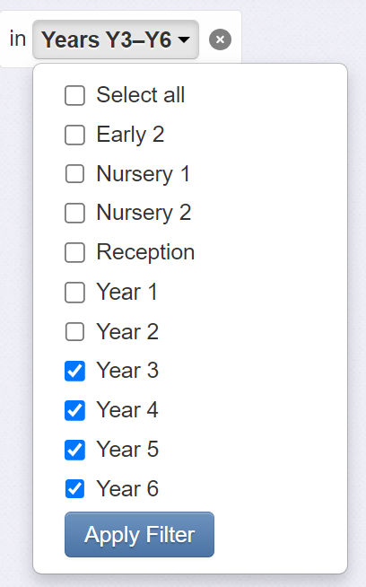
Our final example involves looking at data for all KS2 cohorts. The report compares each year group's progress from KS1 to the end of the current year. Start by clicking on the Year Group drop-down menu at the top, click Multiple selections, and tick years 3, 4, 5 and 6. Note the number of pupils included is shown to the left of each bar chart.
What is probably more useful is to compare year groups. To do this, simply click on Group Pupils and select Year Group.
The result is a report that compares the progress of each year group, in each subject, between KS1 and the latest assessment. For our data, we note that there appears to be a particular issue with Year 4 Reading data, where a higher proportion of pupils have seen their assessments fall since KS1.
Download and Print
If you want to send the report to someone, you can download it as a pdf. Click the Print button and choose Save as PDF. The latter is recommended for emailing and sharing with governors.