Tables report - Working with progress columns
 Updated
In this guide we are going to deal with Progress Columns in the Tables report. These show the difference between two sets of data and are, therefore, very useful for monitoring the change in assessment over time.
If you're new to the Tables report, you may prefer to read our introduction guide first.
This help guide will show you how to:
- Insert a Progress Column into a Table Report
- Use a Progress Column to calculate the difference between two sets of data
- Apply them to different types of data both numerical and non-numerical data
- Aggregate data to group and cohort level to provide summaries
Adding a progress column
The following example table contains two columns of teacher judgements in reading for year 5, one made at the beginning of the year (entry) and another in the autumn term. These columns were inserted by clicking the Add Column button and then selecting Assessment Column.
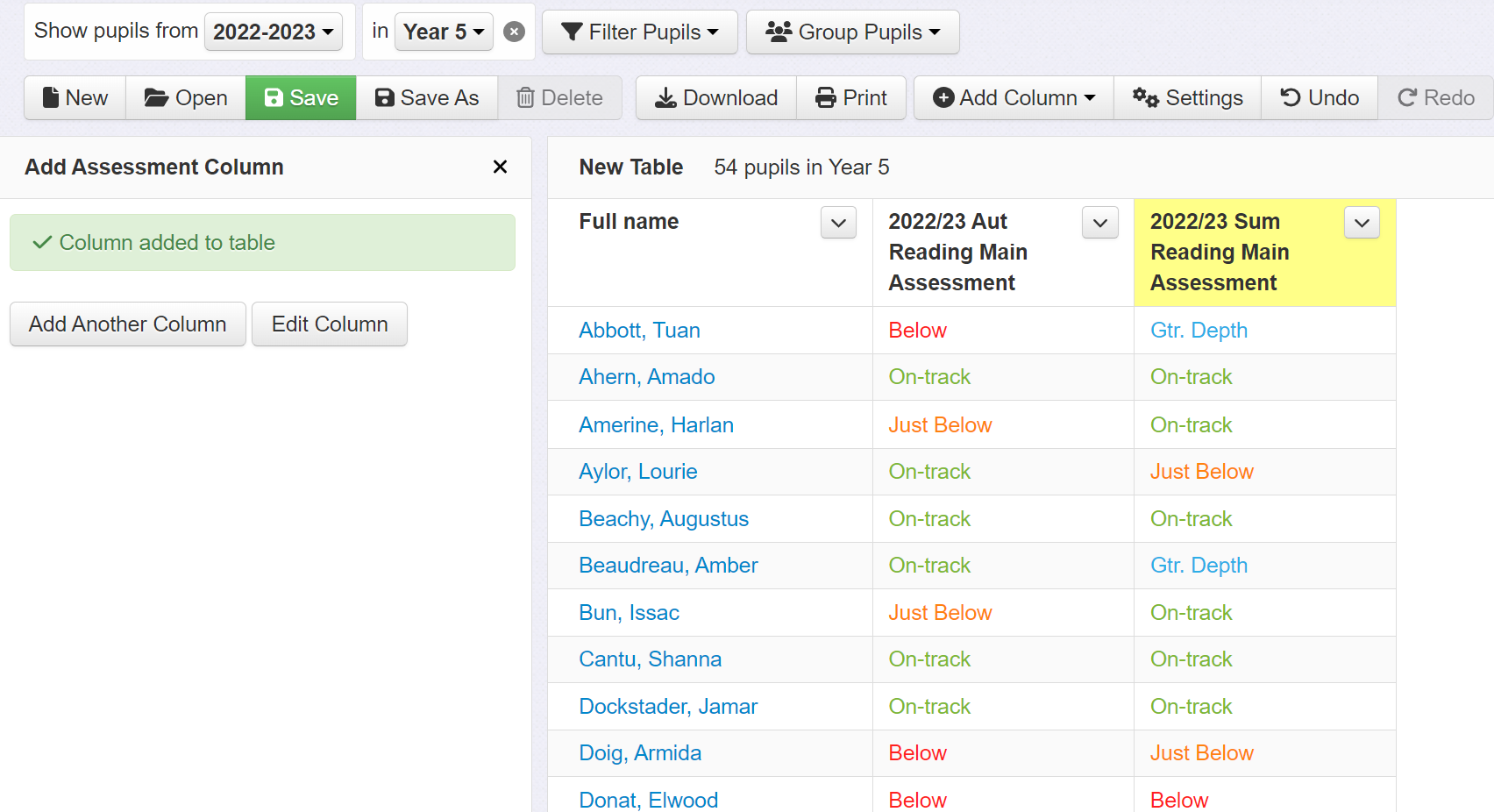
We can now add a progress column to calculate the difference, in this case the change between the two assessment points. Click the Add Columns button and select Progress Column.
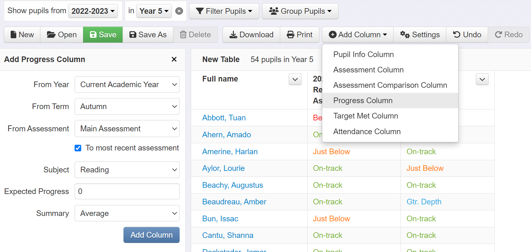
Now simply select the two sets of data that you want to calculate the difference between. As above, these will be entry and autumn teacher judgements in reading.
You are also prompted to enter a number for Expected Progress. If you are using a similar assessment model to that shown below then this should be left as 0. This will flag up those pupils that have moved up or down a band as positive and negative numbers. If you use a steps-based model, enter your school's expected rate of progress, for example 3 steps.
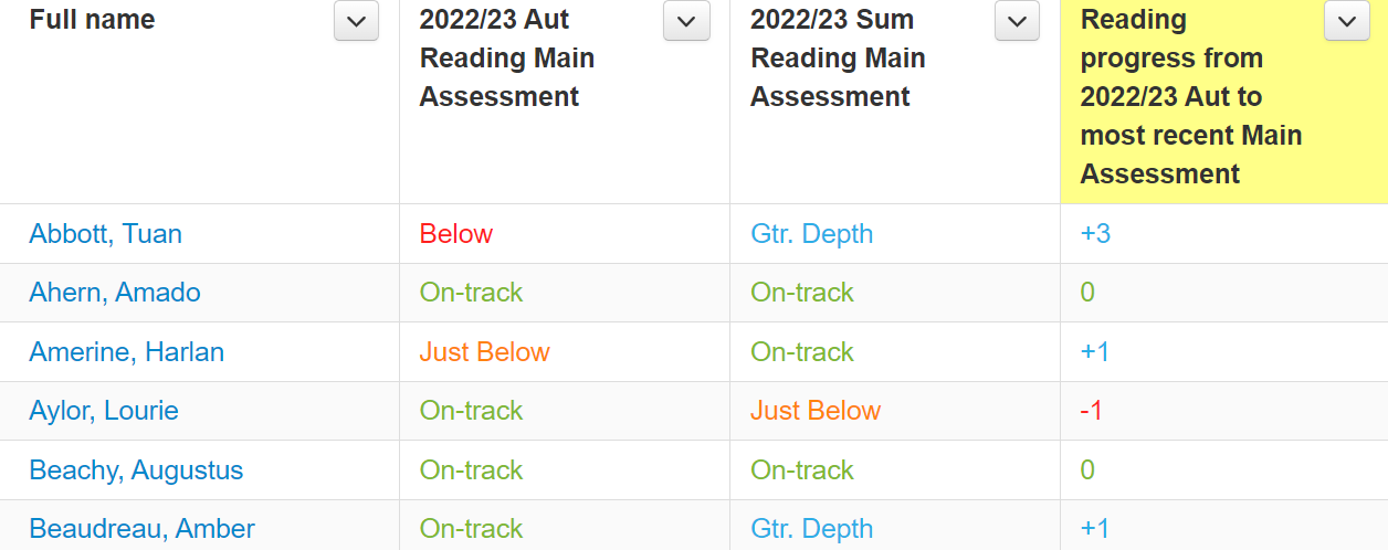
Once you have selected the criteria for your progress column, click the Add Column button. You will now have a new column that shows the differences between the two sets of data. Here, these are presented as positive and negative numbers where there is change, and 0 where no change has occurred.
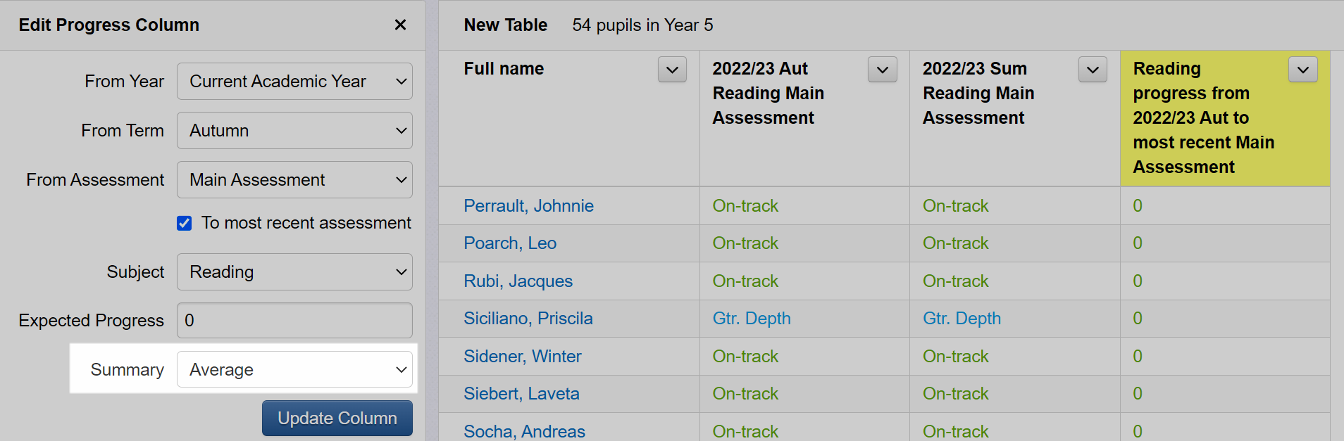
Note the summary column at the bottom, which provides an average of the values in the progress column.
You have the option to change the summary data. By default, this is set to 'average' and this calculates the average of the individual pupil progress scores. By clicking on the summary dropdown, you can switch to a percentage option, which will, for example, show the percentage of pupils making expected or better progress.
Using a progress column with test scores
We can use progress columns for many different types of data and they, perhaps, lend themselves best to test scores where they can quickly calculate the differences between two sets of results. Our example table now has two columns of standardised scores from a reading test taken in the autumn term and summer term in the current year. We can use a progress column to calculate the change in score between these two points.
The set up is the essentially same as above but there are two key differences: the assessment has changed and expected progress is now a range of values. We have changed assessment category to switch the focus from teacher judgement to test scores, and expected progress is within a range because test scores are fine graded assessments, and we therefore have a wider tolerance of change.
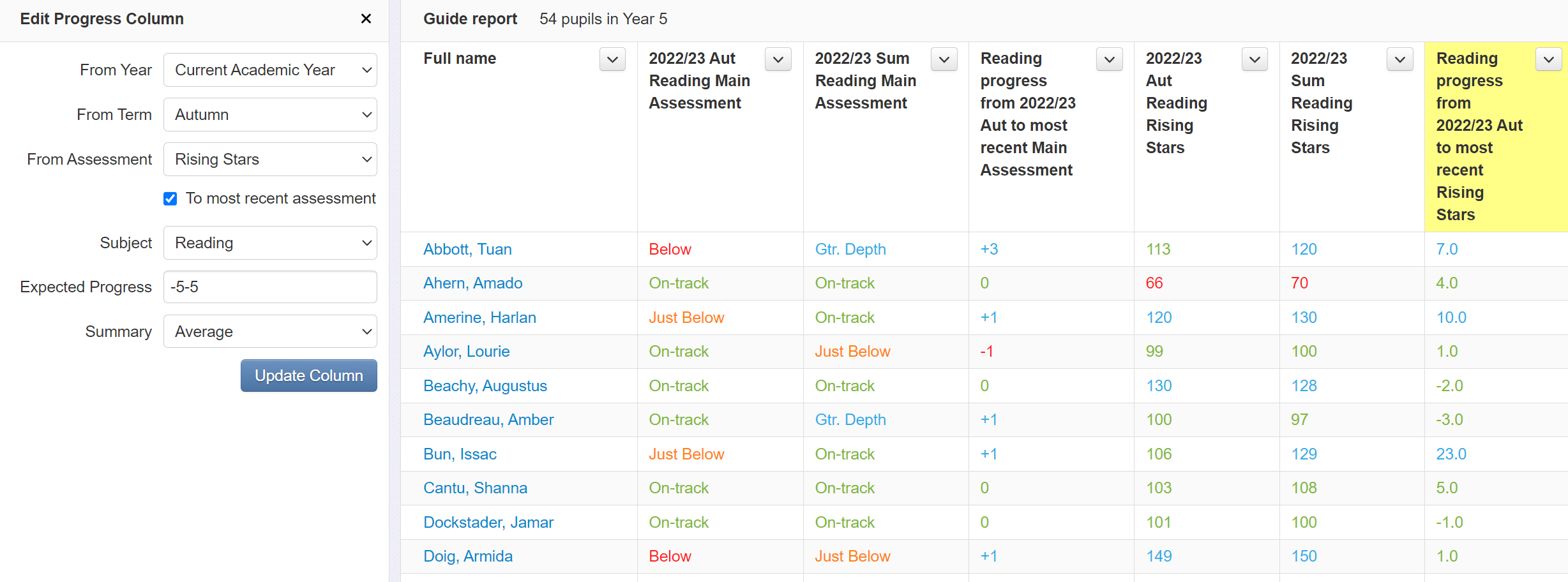
In this example, expected progress is set to -5-5 (i.e. between -5 and +5). Any change within that range will be colour coded green; and change outside of that range will be blue (if positive) and red (if negative).
Again, we have a summary row that shows the average change in test score.
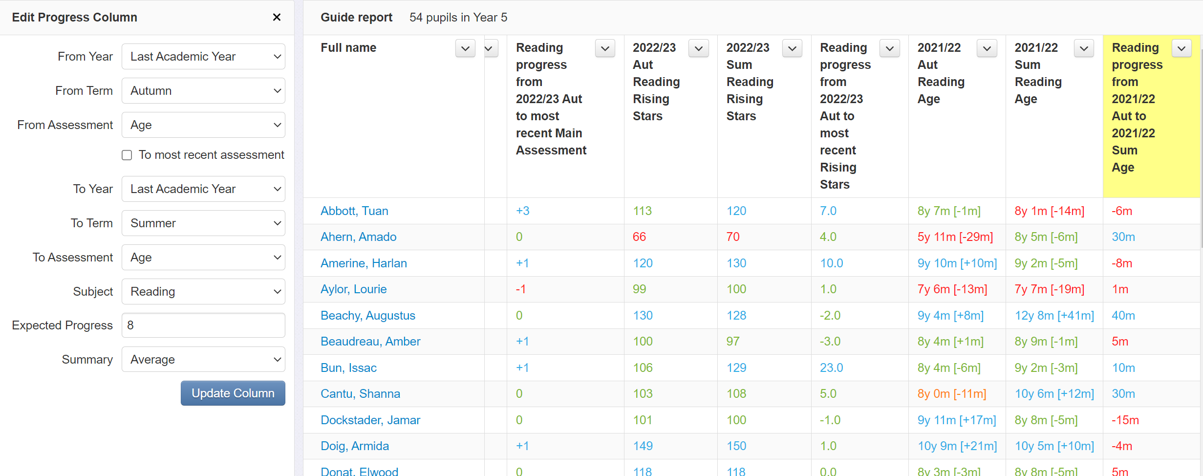
Using a progress column with age assessments
Many schools make use of assessments that provide reading, spelling and even maths ages for pupils in a years/months format. This data is useful as it is easily understood by key audiences such as parents, and is particularly useful for SENDCOs who want to use data to show small amounts of progress in order to monitor the effectiveness of interventions. Insight allows schools to store and analyse this data, and we can use a progress column in a Tables report to calculate the change in age assessment.
Our example table now has two columns of reading ages for the spring term of the previous term and the autumn term of the current year. A progress column has been added to show the change in reading age between these two points. Again, this column is inserted by clicking the Add Column button and selecting Progress Column from the drop down menu.
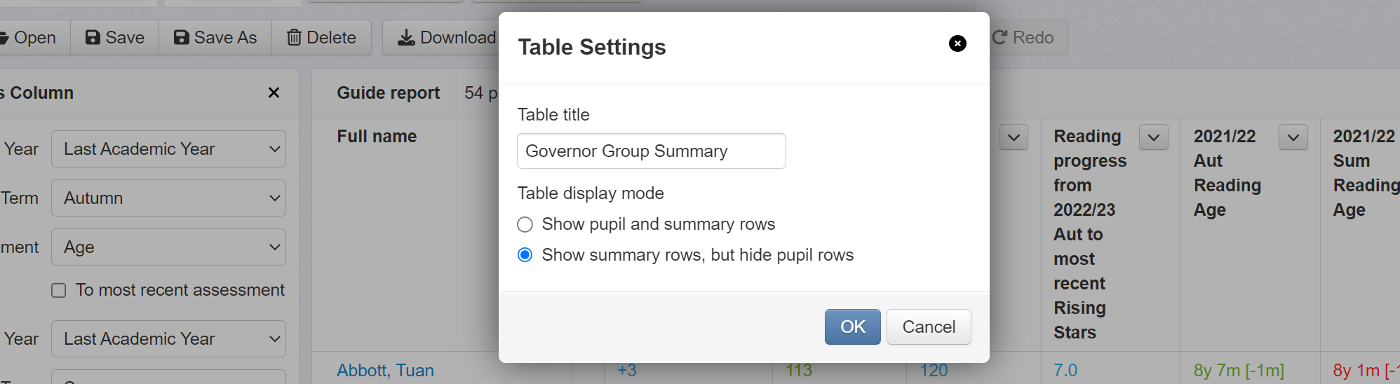
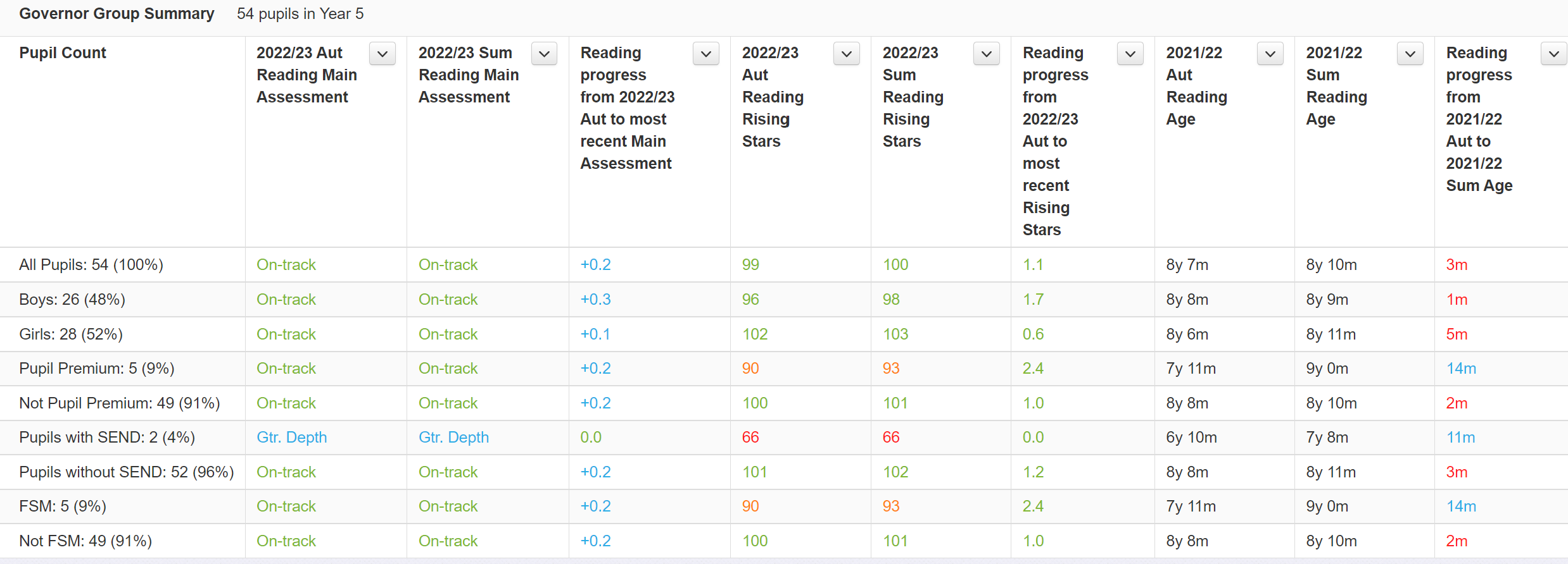
Summarising the table for Governors
You may want to share this table with governors and you'll therefore want to remove pupil names and perhaps group the data instead. To do this, click on the Settings button, give your table a name, and click the Show summary rows, but hide pupil rows option.
This will remove pupil names and reduce the table to a single summary row. Now select a grouping option. Here, we have selected the Key Groups option.
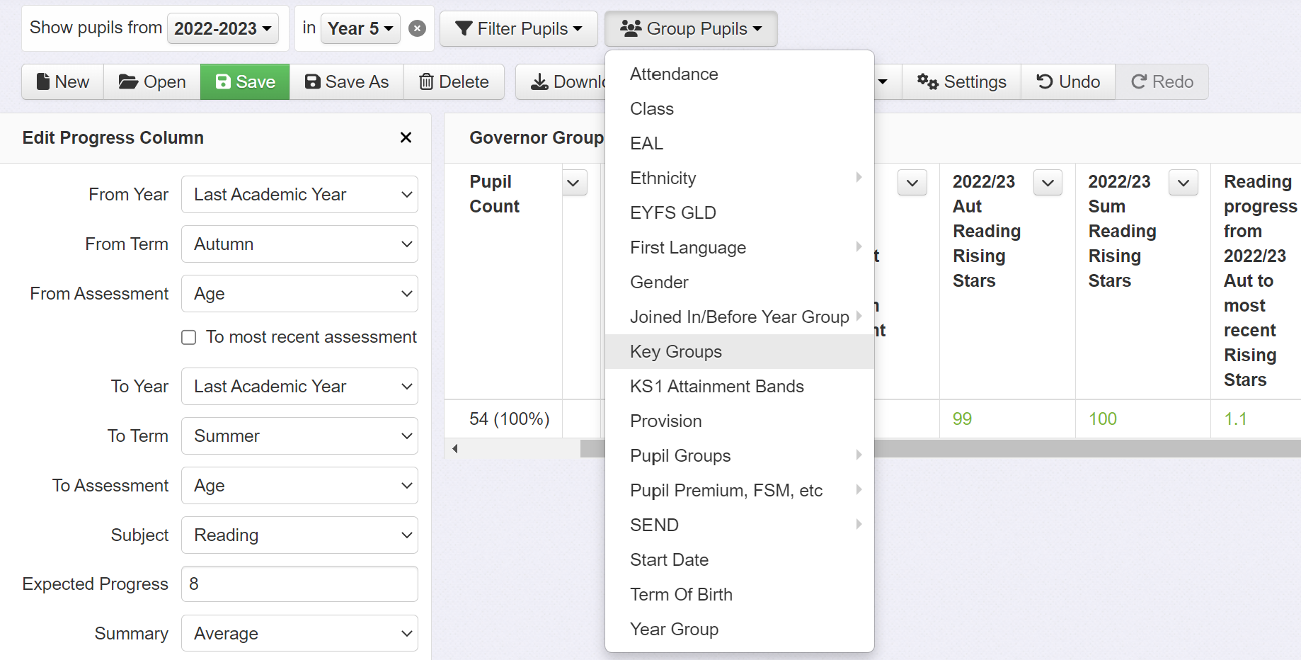
This will now provide a summary for each Key Group.
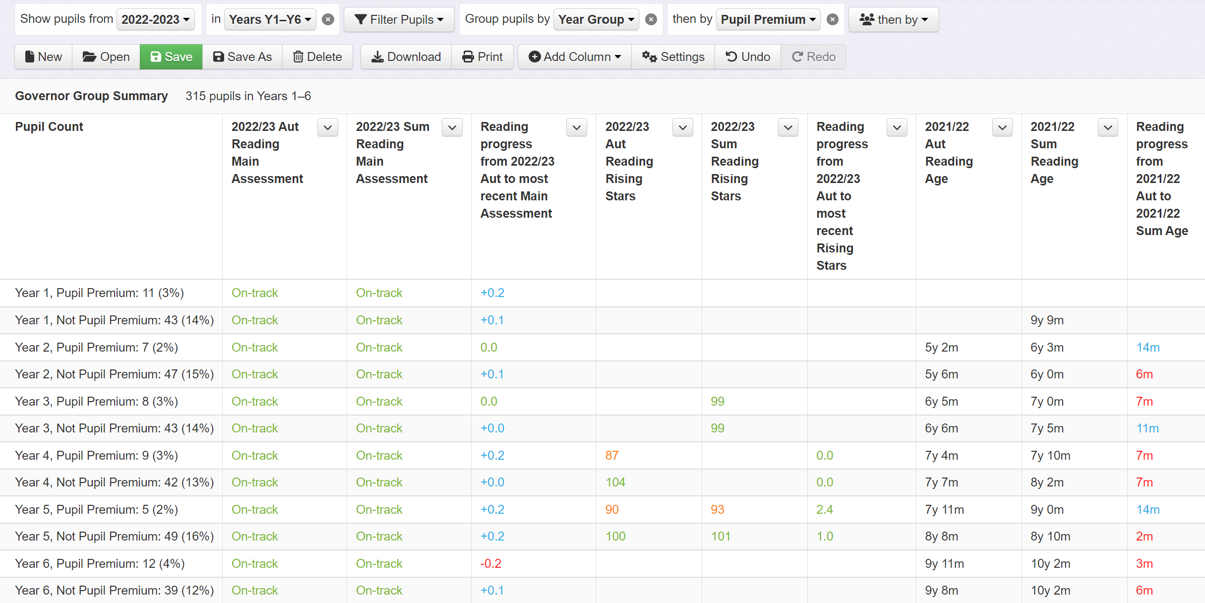
If you want to apply this table to another year group, simply change the year group selected at the top. Alternatively, select more than one year group by clicking on the Year Group menu and choosing Multiple Selections. Our example now includes year 1 to 6 and is grouped first by year group and then by pupil premium.
And finally...
You can download your table to Excel if you want to add it to a report.