Tables report - Building your own Key Group Summary
 Updated
Often, senior leaders resort to manually summarising data in Word or Excel, filling out a table with numbers drawn from various sources in order to report to Governors and others. Sometimes this may even involve working out percentages on a calculator. If this situation rings a bell, then Insight Tables is the tool you need.
Tables allow you to store all your data in one place by simply inserting columns. Contextual information, attendance, prior attainment, teacher assessments, test scores - a table can hold it all and present it at pupil level (very useful for a class teacher wanting an ongoing record of achievement for each pupil), as well as group and cohort level (very useful for governors).
It's the latter that we'll concentrate on here.
In this guide, we'll assume you've already covered the basics and launch straight into building your own Key Group Summary report. Here, we are going to focus on one type of column specifically:
- Assessment Comparisons column
An Assessment Comparison Column will show whether a pupil is, for example, working at or above expectations in one or more subjects based on specified assessment data. At pupil level, this is shown as a simple yes/no value, which is converted to a percentage when aggregated to group or cohort level.
The aim of this guide is to build a table that shows:
- Percentages of pupils that are working at expectations or above over time
1) Creating a new table
First let's open a new table by clicking on the Reports menu and selecting Tables:
This brings up a blank table with a list of pupils. You can use the Filter Pupils button to restrict this to whichever pupils you're interested in, year 6 for example.
2) Adding an Assessment Comparison Column to a Table
As shown in our other help guide you can add columns of pupil characteristics information or assessment data, but here we are going to go straight to adding an Assessment Comparison column.
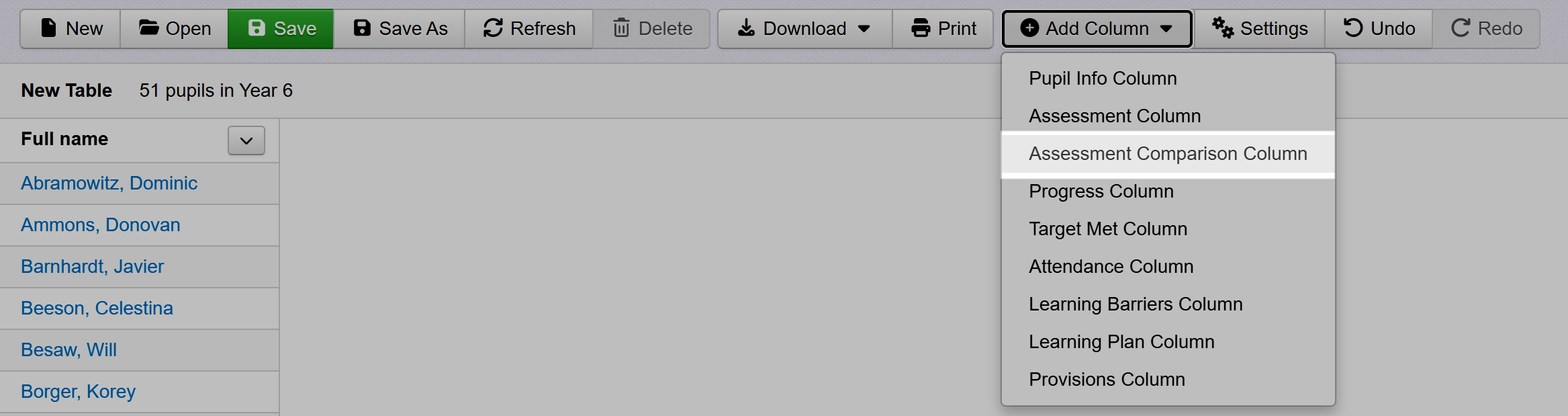
Click the Add Column button and select the Assessment Comparison Column from the menu:
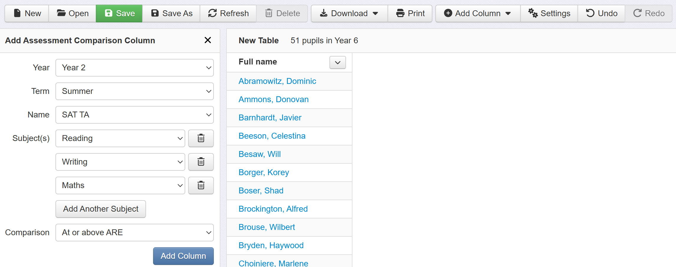
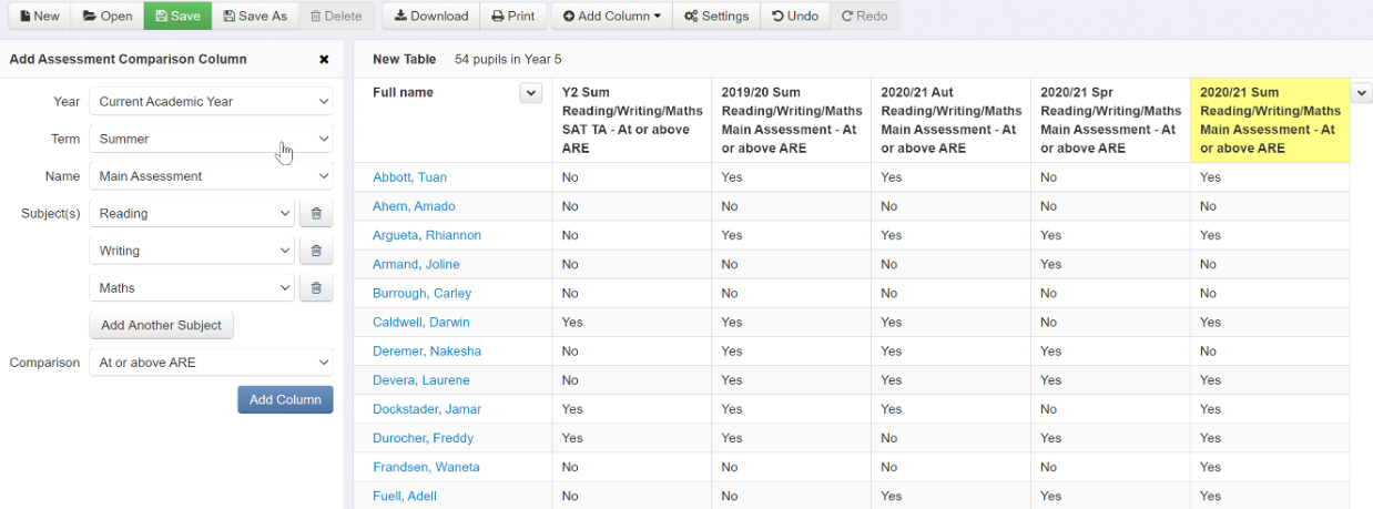
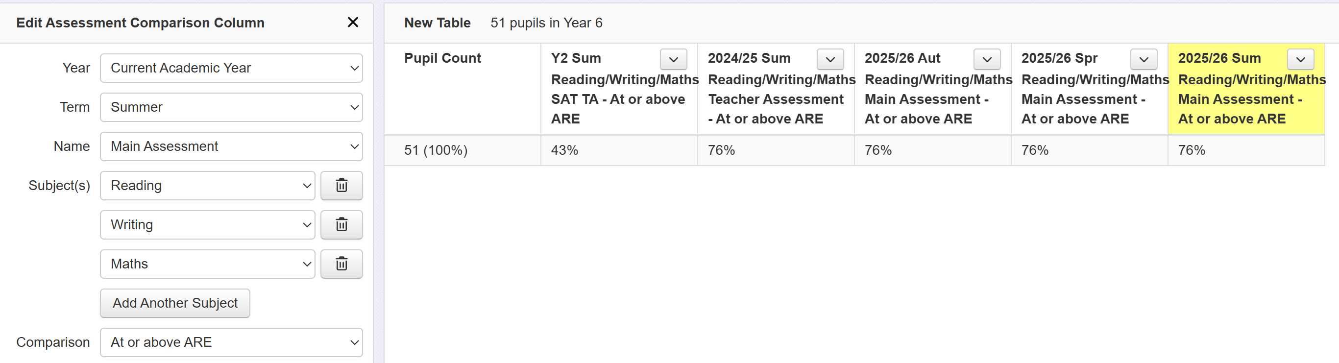
Now we need to select the data for our Assessment Comparison Column i.e. the data that will be used to define whether pupils are working at or above expectations. You could select a single subject for the latest term but here we have opted to use KS1 results i.e. Year 2, Summer SAT TA.
Also note that more than one subject has been selected by clicking the 'Add Another Subject' button indicated. This column will therefore show if pupils met expectations in all three subjects (reading, writing and maths) at KS1.
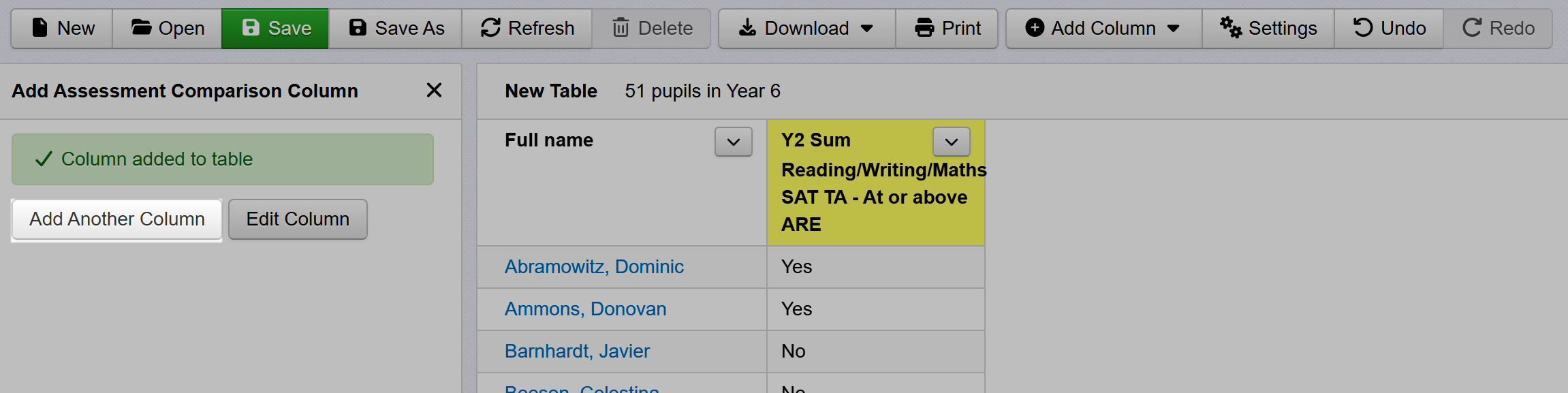
Then click the 'Add Column' button to insert the column into the table. We now have a column of 'Yes' and 'No' values, which indicate whether or not pupils met expectations in all subjects at KS1.
3) Adding more columns
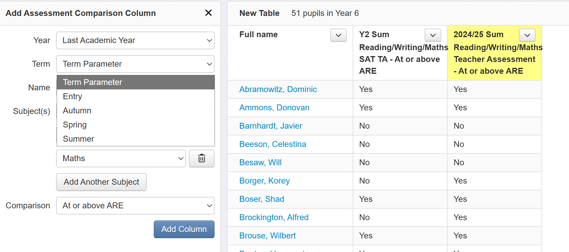
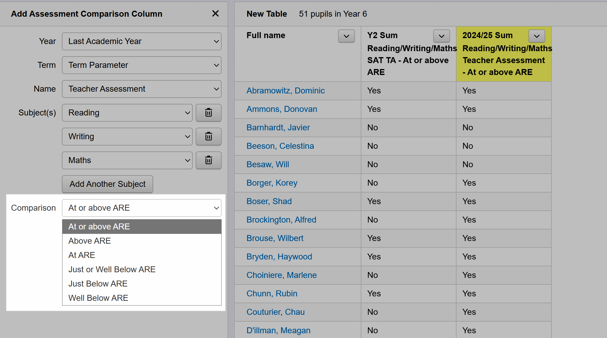
Click 'Add Another Column' and repeat the process, adding in a column for last summer, again to indicate whether or not pupils met expectations in combined subjects. We've changed the year to 'Last Year' and the assessment is changed to our teacher assessments.
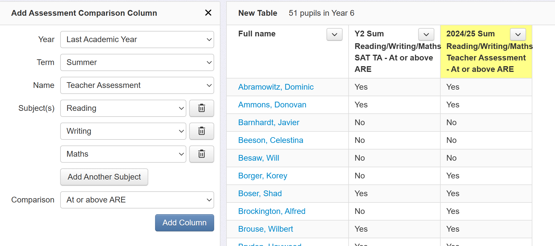
Click 'Add Another Column' again and add columns for each term of the current year. Change the year to 'Current Academic Year' and change the term to Autumn, then Spring, then Summer (i.e. we are adding three more columns to our table). The result should look like the screenshot below: a table showing Year 5 pupils meeting expectations at KS1, at the end of last year, and across the current year, in reading, writing and maths combined.
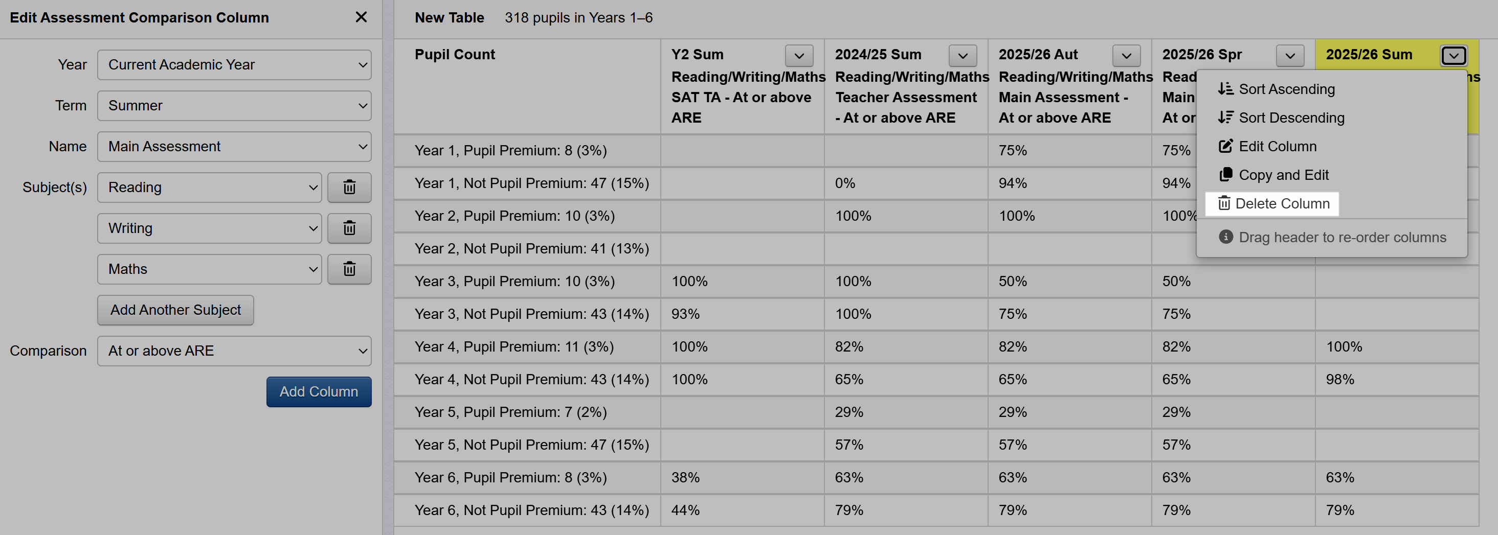
4) Other functions
5) Grouping your table
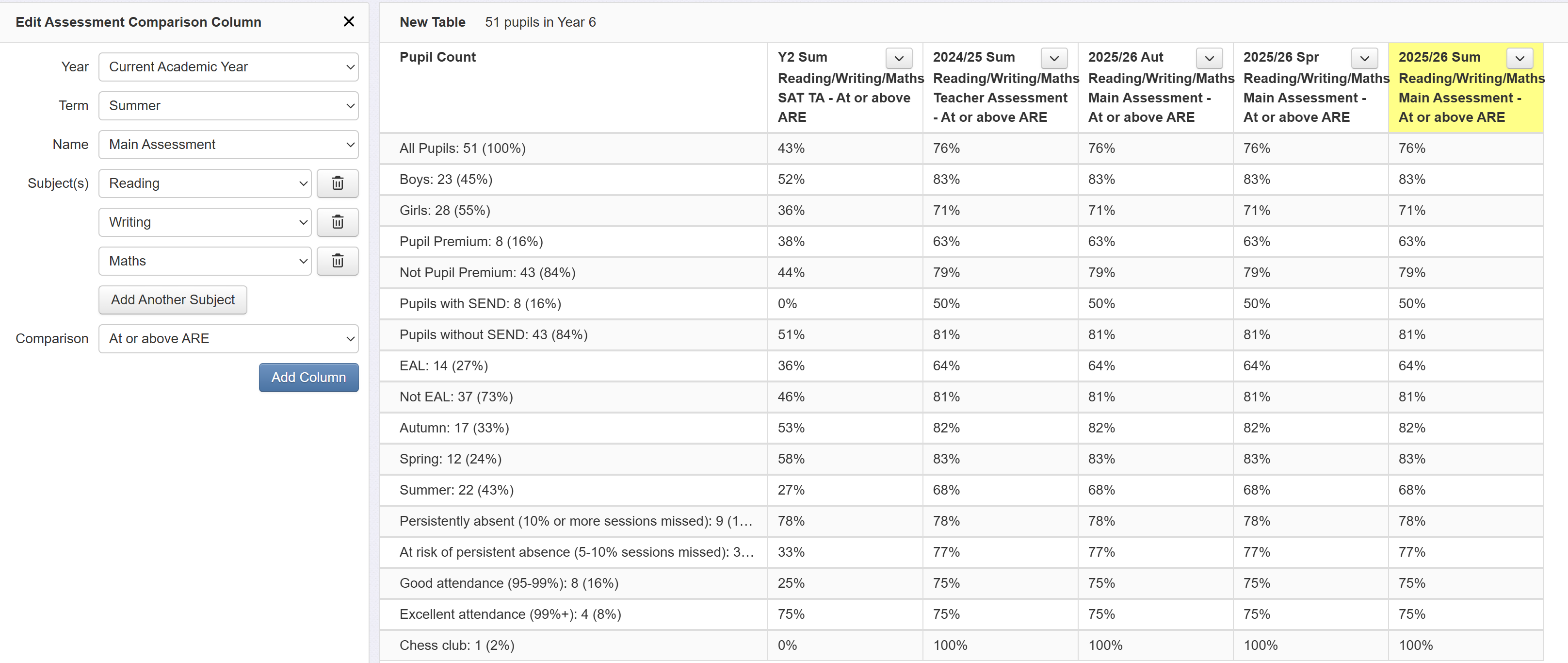
The table in its current form - pupil level - is not suitable for governors. The trick is to remove the pupil names and summarise the data. To do this, click the Settings button.
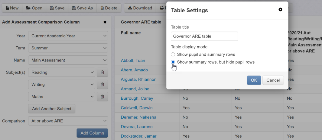
Click the 'Show summary rows, but hide pupil rows' option. This will remove pupil names and reduce the table to a single row of percentages for our selected year group.
Now lets break this data down into groups for a more detailed view. Click on the 'Group Pupils' button and select 'Key Groups'. We now have a Key Group Summary report!
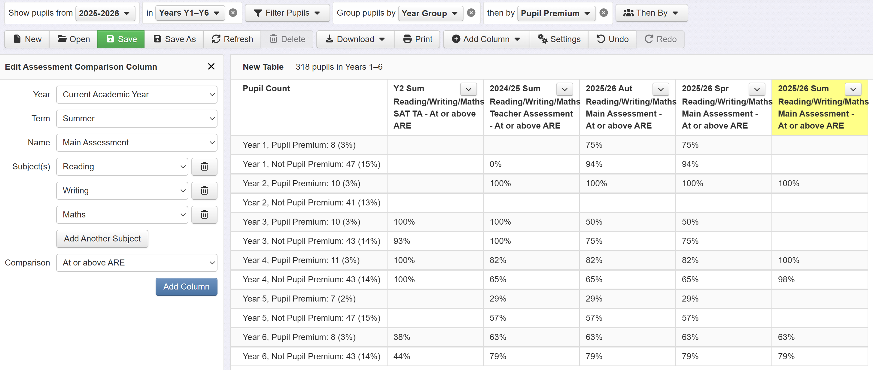
Once created, this table can be applied to other cohorts by simply selecting a different year group at the top of the screen. Alternatively, you could select more than one year group, and then group by year plus another grouping option. Here, for example, the table shows a breakdown of percentages by year group and pupil premium.
6) Finding your table again and editing it
To find your table again, click Tables in the Reports menu, and click the Open button.
And finally...
Click the 'Print' button to print your table or save it as a PDF file. Alternatively, click the download button to export it to Excel.