Headline Reports
 Updated
Headline Reports are designed to display a range of high-level assessment data for your school or Trust in a single table.
They can be used to report on a wide variety of assessments and evaluations, combined attainment and to show progress.
They display a single table view over a range of terms, so are best suited to viewing and comparing related data types together.
In this guide, we'll cover how to create a report, how to add different columns sections and how you can adjust the row and column grouping to best suit the analysis focus you require.
Headline reports are available for individual schools and also for Trusts to view data over multiple schools. Both work in the same way, so we'll focus on single school usage for the purpose of this guide. Where features differ for Trusts, they will be identified.
Using reports
Headline reports are available for schools, showing data for just your school, and for Trusts, showing data collated for all schools in the trust or for specific schools.
Both work in the same way but the initial report selection screens differ as below:
Using reports as a School user
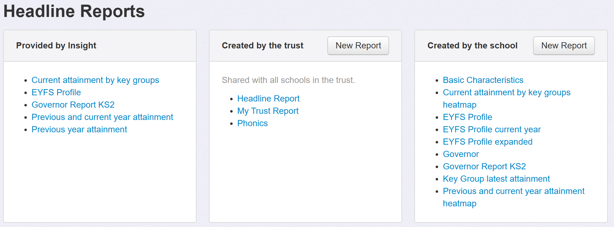
Headlines reports are split into three categories:
- Provided by Insight - Preset reports to give a range of useful views and to provide inspiration for your own custom reports
- Created by the trust - Reports created and shared with all schools in the Trust (if you're part of one). Only Trust "School Users" or higher can create these.
- Created by the school - Reports created in your school
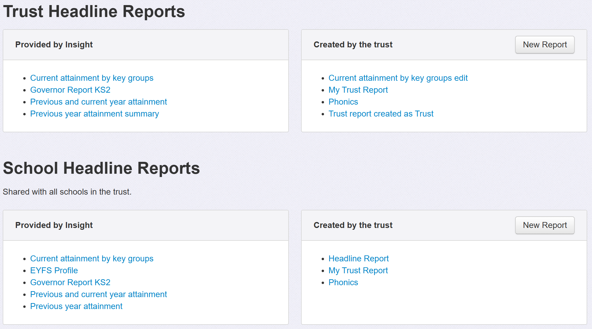
Using reports as a Trust user
Trust Headline Reports are those that collate data over all schools in the Trust.
School Headline Reports display data for a single school only. When running one of these, as a Trust user, you can select the school displayed, from those in the Trust, at the top of the screen.
Using the reports provided by Insight
The preset reports are provided to offer some useful views of your data and also to demonstrate what is possible for you to create yourself.
Click the report name to view it.
The report will include some buttons along the top.

Headline reports do not automatically refresh their data each time you view them. This is to enable a quick display as it can take a few seconds to generate a report for a large school.
If you think the data may have been updated since the report was last refreshed, click Refresh Report to update all the values.
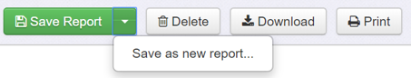
If you find a preset report useful, but would like to make changes to it to better suit your needs, you can save the preset report into your own report list and then edit it from there. Click Save Report As... to achieve this.
Download will save the report as an Excel file; useful if you want to continue further work with the figures therein.
Finally, use Print to preview and print the report displayed.
Creating a new report
Editing and creating Headline reports is not limited to Admin users. Normal users are also able to do so.
Click New Report report to begin, in whichever section is applicable.
The report setup is split into four, distinct, sections. We'll go through each in turn:
1. Choose Pupils
This is where you can define or restrict the pupils used to create the report.
This includes choosing from the current, or previous, academic year (useful to ensure your report always uses data relative to the current time) or a specific academic calendar year (useful if you know that you always want this report to describe a specific year, regardless of when you run it). The Year options are also available within each segment in the report, so may not need to be set here.
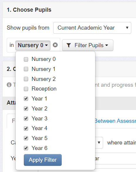
The filters work in the same way as throughout Insight, allowing you to choose a range of specific year groups, for example.
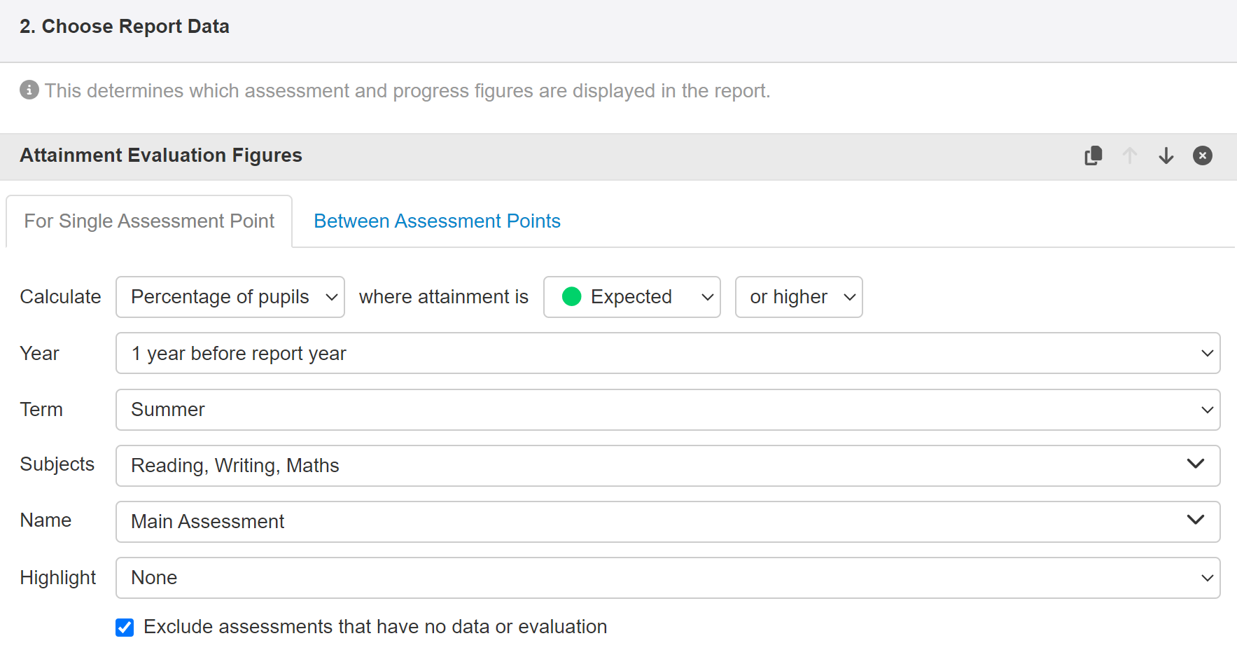
2. Choose Report Data
This is where you define exactly what data you want in your report.
You can add multiple segments, with different assessment data and settings, but we'll start with just one.
Assessments can be selected for individual terms using the Single Assessment Point, or click on Between Assessment Points to include assessments from two or more terms.
The control buttons in the top right corner can be used to duplicate the segment, move it up or down on screen or delete the segment entirely. The on-screen position of the segments does not directly affect the sequence of the columns in the report - this is based on the grouping options in Section 3.
The report can show the Percentage of Pupils, Number of Pupils or Fraction of Pupils for the chosen assessment and subjects. The fraction figures are based on the total number of pupils in that row, which depends on the filters and grouping options.
The Year and Term should be set as required. You can select assessment data from the Report Year or 1-3 years before it. The Report Year is whatever you have selected in section 1. In other words, if you have Last Academic Year selected in section 1, and choose 1 year before report year in a section 2 segment, you will get data for two academic years ago.
You can also choose to show specific individual academic year groups for the filtered pupils.
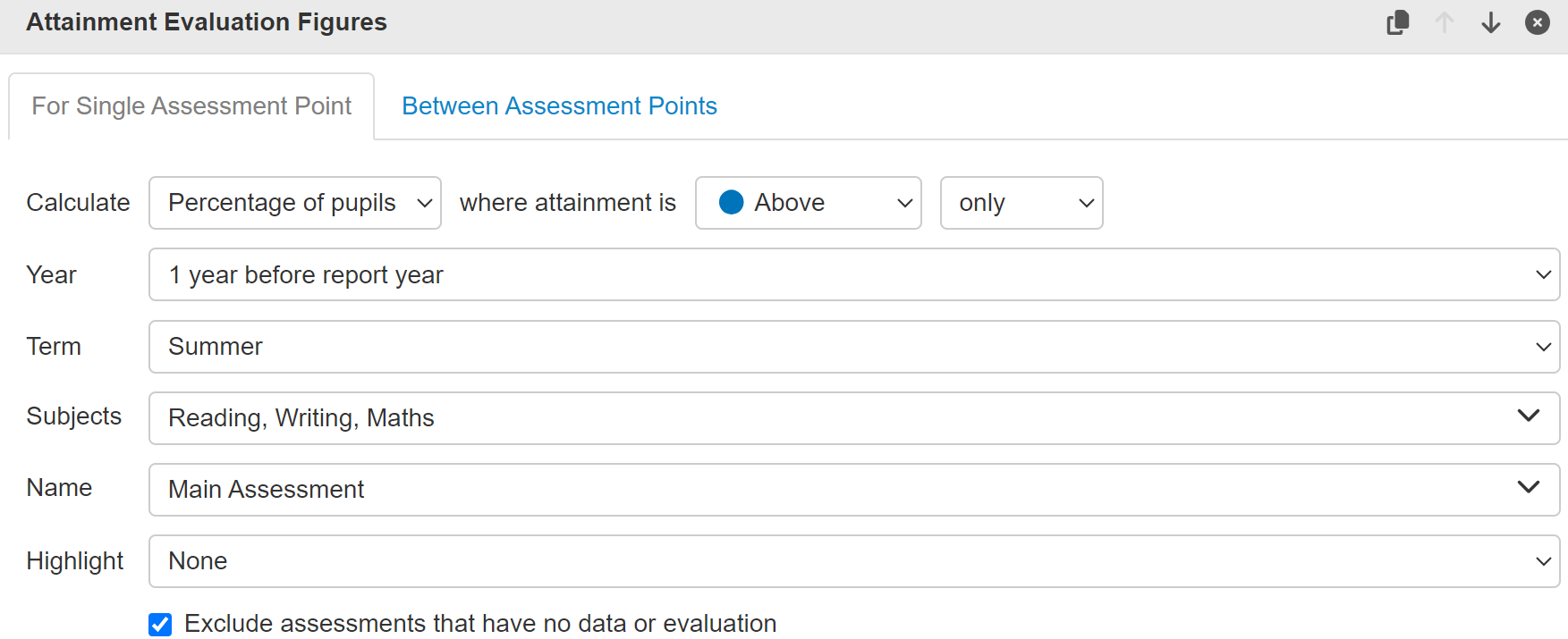
Where attainment is can be used to select individual attainment bands or to include higher or lower bands. This is an easy way to display Expected or Higher assessments (especially with Combined Attainment Evaluation Figures - see below). Use the Duplicate button to create a similar section, but set to Above only.
Highlighting
When adding percentages you also have the option to add highlighting. This provides a heat map function where you can choose to highlight high or low values, using a sequential colour scale with the highest/lowest value at the lowest opacity. These options are useful when you don't have a specific pivot point in mind between what you consider to be high or low values. Or you can choose to compare to a defined value, to create a diverging colour scale where all values below the defined value are increasing shades of red and all values above are increasing shades of blue. This is most useful when you are able to specify a percentage that values either side of are considered high or low.
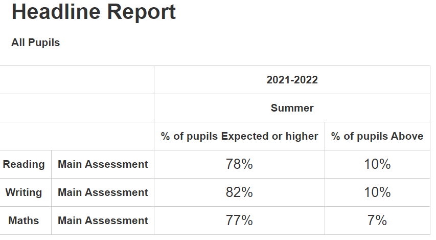
The resulting report will display the percentage of pupils of Expected or higher attainment in one column, and the percentage Above in a separate column alongside.
Click Edit Report to return to the setup screen.
Use the Subject and Assessment Names to choose the data you want to see. Normally, this will be a teacher assessment but it could be your SAT Teacher Assessments, SAT Scaled Scores, Standardised Scores or anything else in Insight. The Attainment Evaluation figures are based on the coloured evaluations of the assessments rather than the scores themselves so they can only work with evaluated assessments. You can include as many assessments as you like but we think that limiting each report to 1 or 2 is more manageable.
The Between Assessment Points tab should be used to compare assessments from different terms. Select a start and end term to get two columns of data or tick Include Interim Terms to include data from all the terms in between.
To set up more columns, click on the Add More Report Data button. The following list will appear.
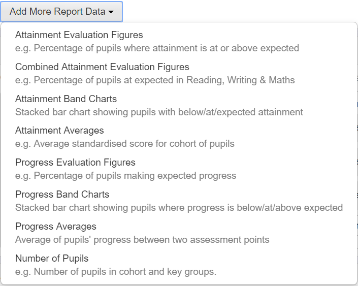
Combined Attainment - this option can be chosen when you need to see the attainment percentages for multiple subjects, for instance Reading, Writing and Maths. To only include pupils with assessments in all the chosen subjects tick "Exclude combined records that have missing data or no evaluation". The figures can be produced for multiple terms by using the Between Assessment Points tab at the top.
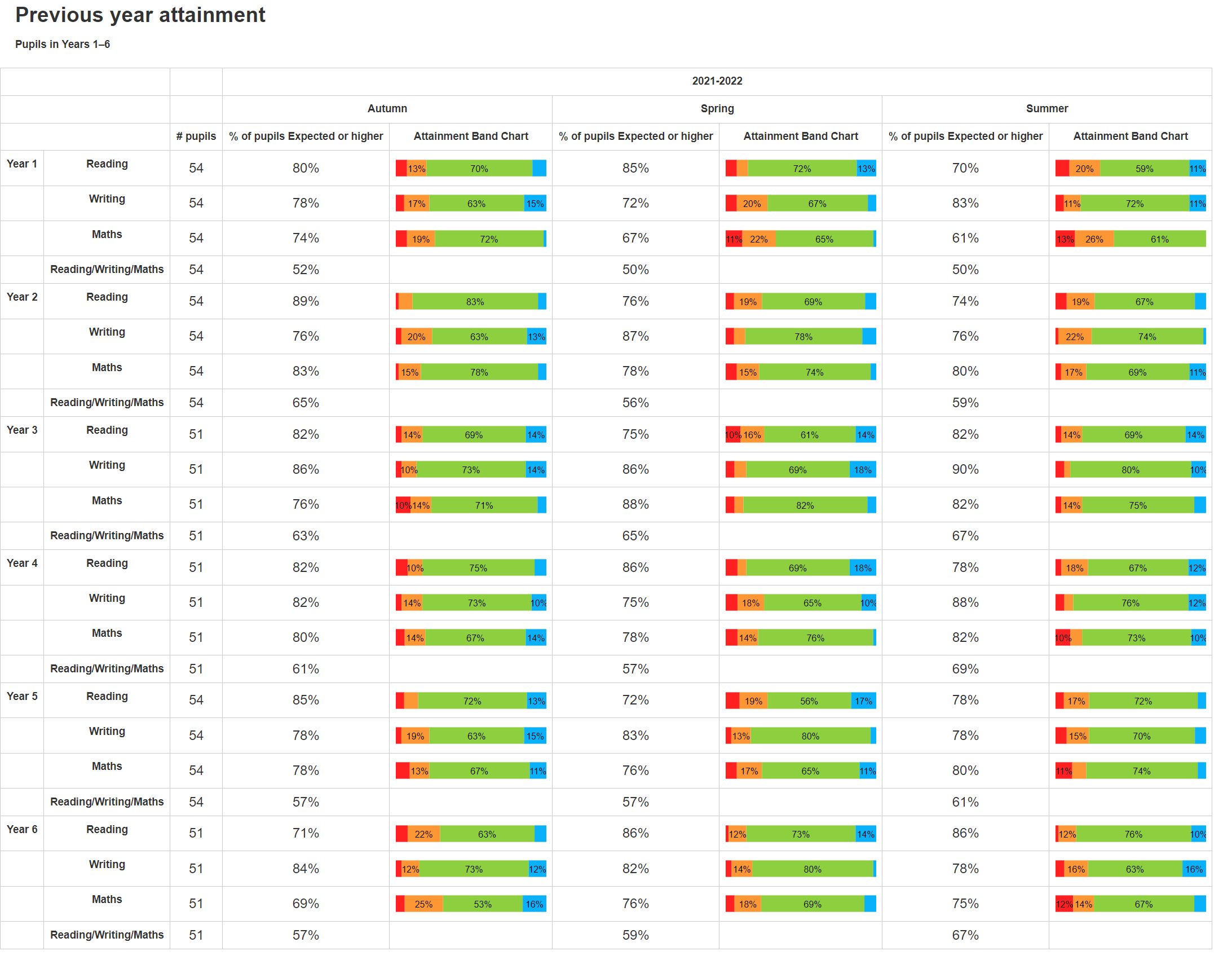
Attainment Band Charts - these bar graphs of attainment display sections for the evaluation of the assessments. They are similar to the Overview - Attainment graphs available on the Cohorts menu in Insight. Pupils with missing or un-evaluated assessments will be included in a grey section of the band chart unless the option "Exclude assessments that have no data or evaluation" is ticked. The chart can be produced for multiple terms by using the Between Assessment Points tab at the top.
Attainment Averages - these will display an average of the assessment scores. Suitable for numerical assessments. To only include pupils with assessments in all the chosen subjects tick "Exclude combined records that have missing data or no evaluation". The figures can be produced for multiple terms by using the Between Assessment Points tab at the top.
Progress Evaluation Figures - the progress versions of the report need a value for Expected Progress. This should be zero for Point-In-Time assessment models (PITA) where the assessment won't change, but it may have different values depending on your mark scheme and the number of terms you are looking at. Normally this would be a single number but the system can accept a range: for example, with standardised scores the range -5 to +5 can be achieved by using "-5-5", for example.
Progress Band Charts - Progress bands are similar to the Attainment Band charts for grouping pupils but they need to be given an Expected Progress value and start and end terms to show progress between (as for Progress Evaluation above).
Progress Averages - with similar settings to the Progress Band Charts the Progress Average can be used to show an average progress figure between the two terms.
Number of Pupils - the number of pupils in a group can be shown in a separate column based on the grouping options. Please note that this figure will include pupils with missing data who may not be included in some other assessments on the report, such as percentages.
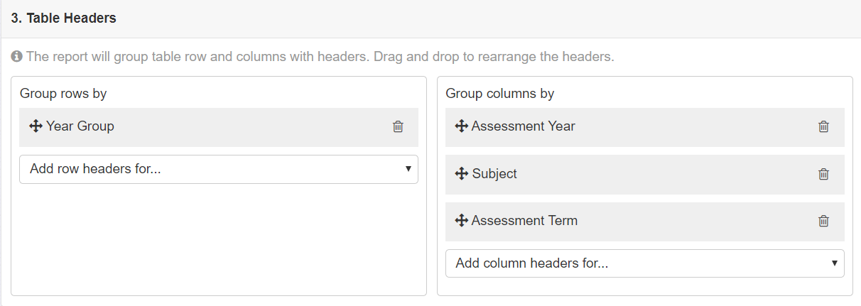
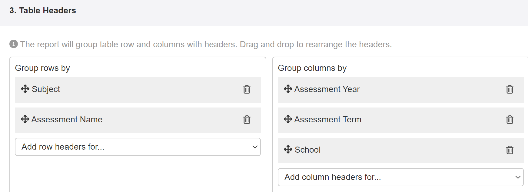
3. Table Headers
The assessment data for the report can be sorted into rows or columns using the Headers. The options for row and column headings are identical, and they are similar to the filter and group options elsewhere in Insight. The Add headers menus allow you to add additional headers, such as Year Group. You can also use the small trash icon to remove any unwanted headers.
Setting the headers like this:
Will give a Headline Report that looks like this (with some added Highlighting options):
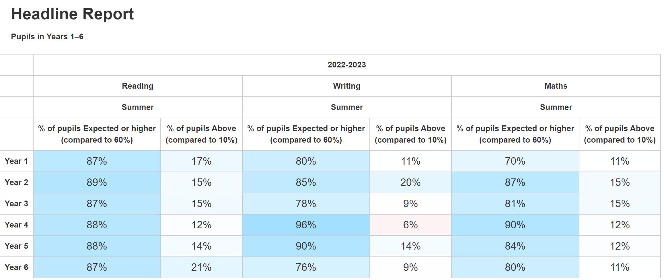
Note that the sequence of the column headings matches the sequence in section 3: Assessment Year, Subject, Assessment Term.
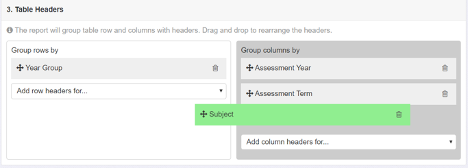
Click on the drop-down lists to add new row and column headers. The options can be re-ordered or moved between rows and column sections by clicking and dragging the crossed-arrows icon:
Changing the sequence of the table headers will change how the headings group the data on the report. You can have as many headers as you like but more than 3 can get hard to read. For statutory assessments the term is normally Summer (or Summer 2 when tracking half-termly) so the Assessment Term is not always needed.
If you are accessing Trust multi school reports (rather than single school reports shared over the Trust) you will have the additional option, added by default, to include headers for each school in the Trust.
4. Report Title
Lastly, don't forget to give your report a meaningful name!
When you are ready click on the Generate Report button at the bottom. After a few moments your report will appear. If you make any changes to the report you will need to do this again. Click on the green button at the top to save your report or use the drop down icon to save as a new version with a different name.