Scatter Graphs - Setting variable thresholds for KS2 practice test results
 Updated
The main purpose of a scatter graph is to plot two sets of test scores to investigate whether or not there is a correlation. We might want to look at the relationship between the results of consecutive standardised tests, between the results of mock SATS and the final KS2 tests. The latter is particularly useful as it can help ascertain scaled score thresholds that act as indicators of expected standards at KS2 rather than adopting a blanket threshold of 100 regardless of when the practice test was taken. Children are less likely to achieve a scaled score of 100 early in the year but we might find that a lower score is a strong predictor of expected standards by plotting scores from practice tests against those achieved at the end of KS2.
With norm-referenced standardised tests, where pupils' scores tend to remain fairly stable over time, a consistent set of thresholds is usually applied throughout, regardless of subject and the year or term the test is taken. With KS2 practice tests, on the other hand, scaled scores - which are not norm referenced - tend to increase as pupils secure more knowledge (and become more familiar with the tests!) over the course of year 6. By using Insight scatter plots, we can investigate the relationship between results of practice and final KS2 tests, and use that information to set smart thresholds for each assessment point that can act as indicators of expected standards at KS2. Insight has this capability.
First, select Scatter Graph from the Reports menu:
Then select the data you want to compare. In this example, the results of a KS2 reading test taken early in year 6 are plotted against those from the test taken at the end of the year (note mock SATS is selected in both cases because there were no official KS2 tests in 2021).
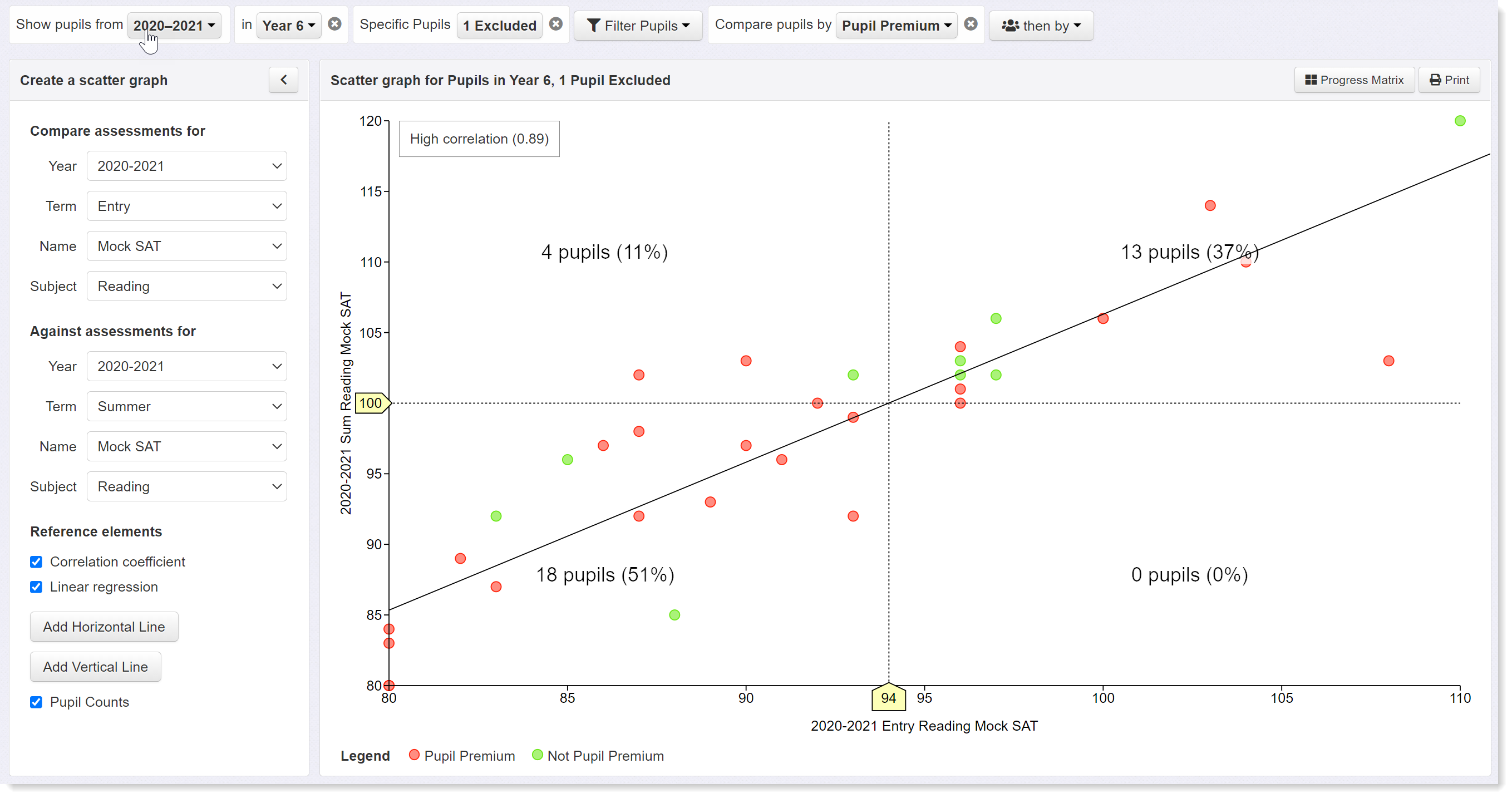
First, note the correlation coefficient in the top left hand corner of the graph which is displayed by selecting the check box in the left hand panel. There is little point in continuing with this process unless there is a strong correlation between the two datasets. In this case the correlation coefficient is 0.89, which is high and indicates a good relationship between the two sets of data. We can therefore proceed with a high degree of confidence. A linear regression line is added by clicking on the relevant check box in the left hand panel. This shows the line of best fit between the two data sets.
The horizontal axis represents the scores from the practice test (Mock SAT) taken early in the year; the vertical axis represents the scores of the tests taken in the summer (i.e. at the end of the year). Reference lines have been added with a horizontal line set to indicate expected standards (scaled score of 100) in the summer tests. Then add a vertical line and drag it until it intersects with both the horizontal and best fit line. In this example, the intersect occurs at a score of 94 on the horizontal axis. Because we have a high correlation between the two datasets, we could adopt a threshold of 94 scored in practice reading tests taken early in the year as a indicative of reaching expected standards at the end of the year.
Now let's plot the same graph comparing scores from autumn and summer tests:
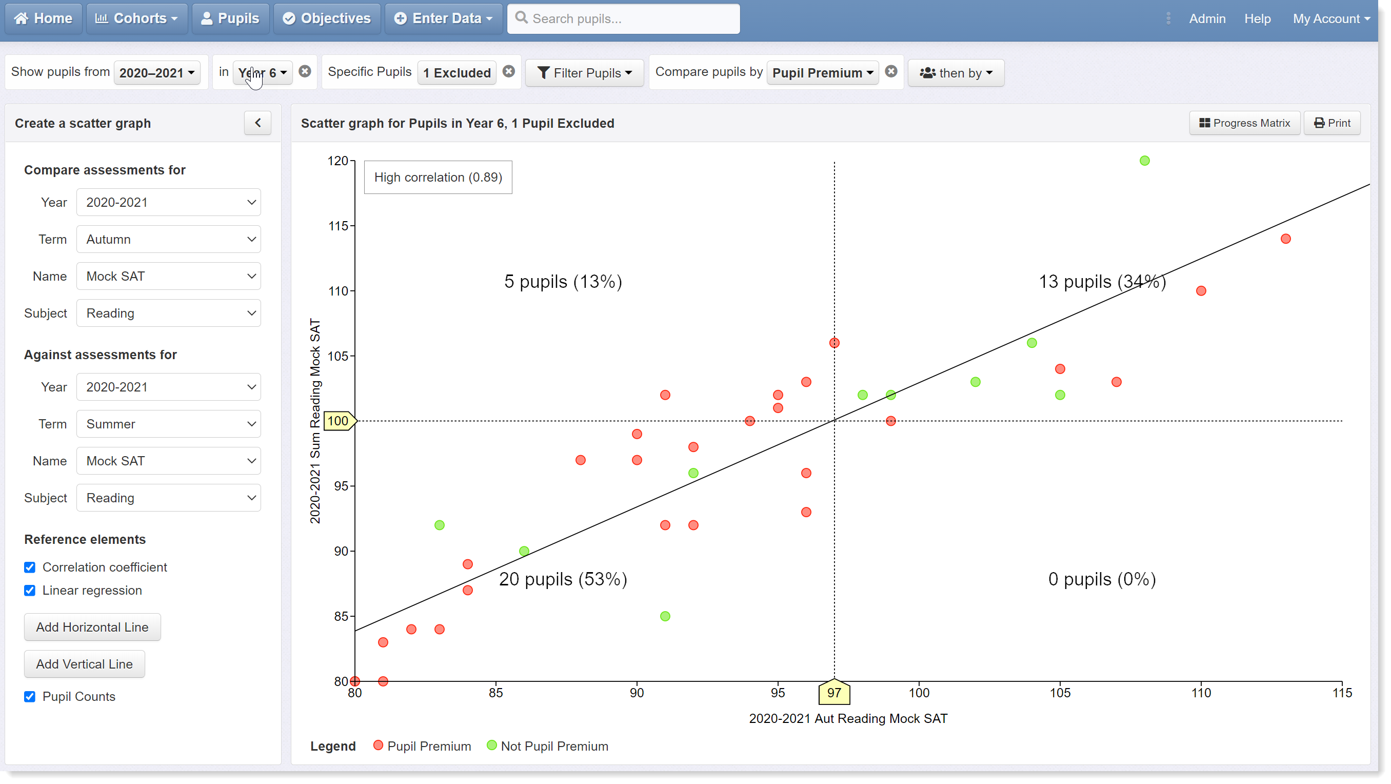
The set up here is exactly the same except for the change of term to autumn for the horizontal axis. By dragging the vertical reference line across to the intersect, we can see that the value has increased to 97. We can therefore adopt a score of 97 in the autumn term reading test as indicative of reaching expected standards at the end of the year.
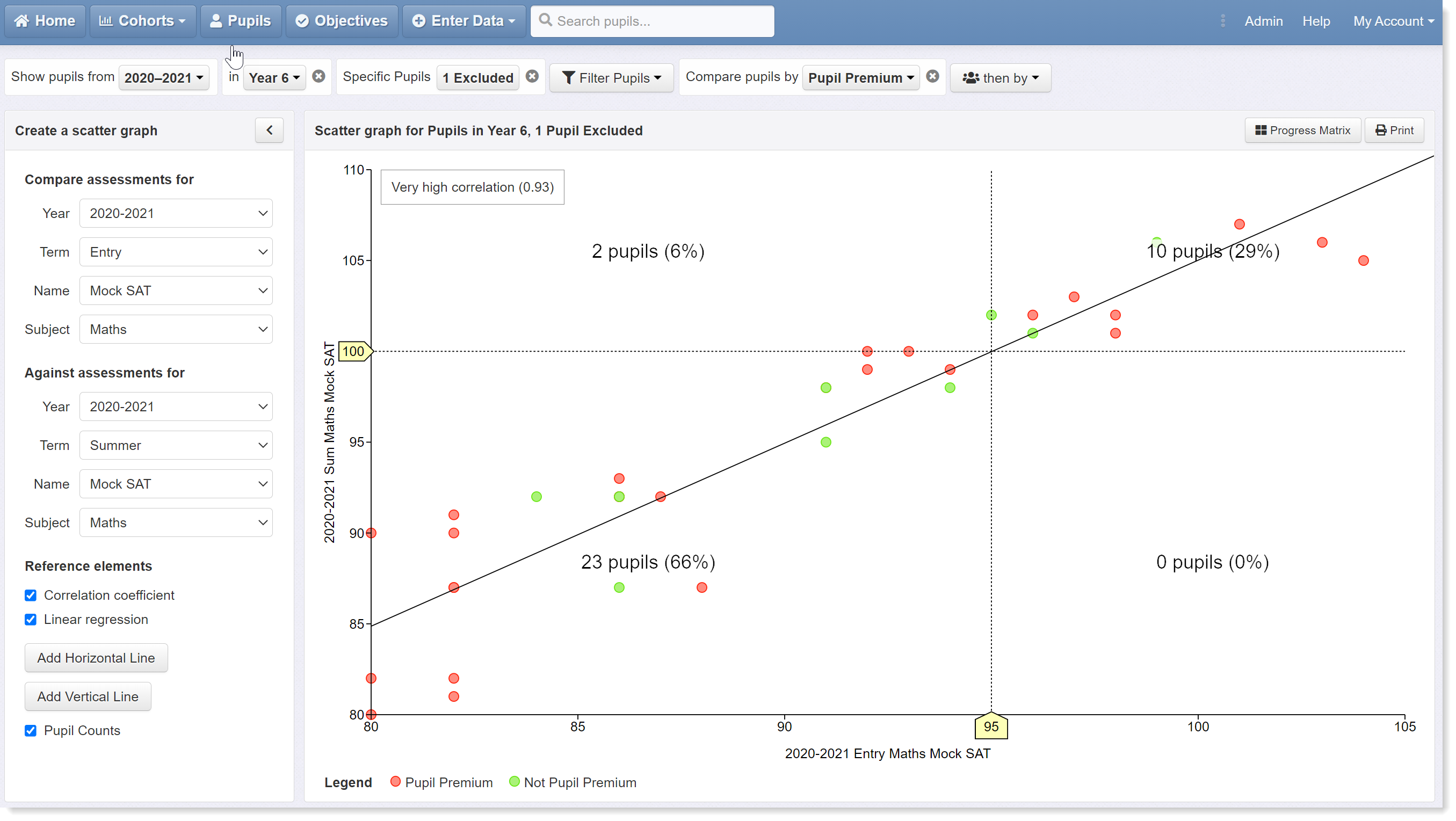
Now let's look at maths. The next two scatter graphs plot results from practice tests taken early in the year and at the end of the autumn term against those from summer tests.
Plotting early test scores against the summer results reveals the intersect on the horizontal axis to be score of 95, which we can adopt as our indicator of expected standards at the start of the year.
This increases to a score of 98 in the tests taken at the end of the autumn term:
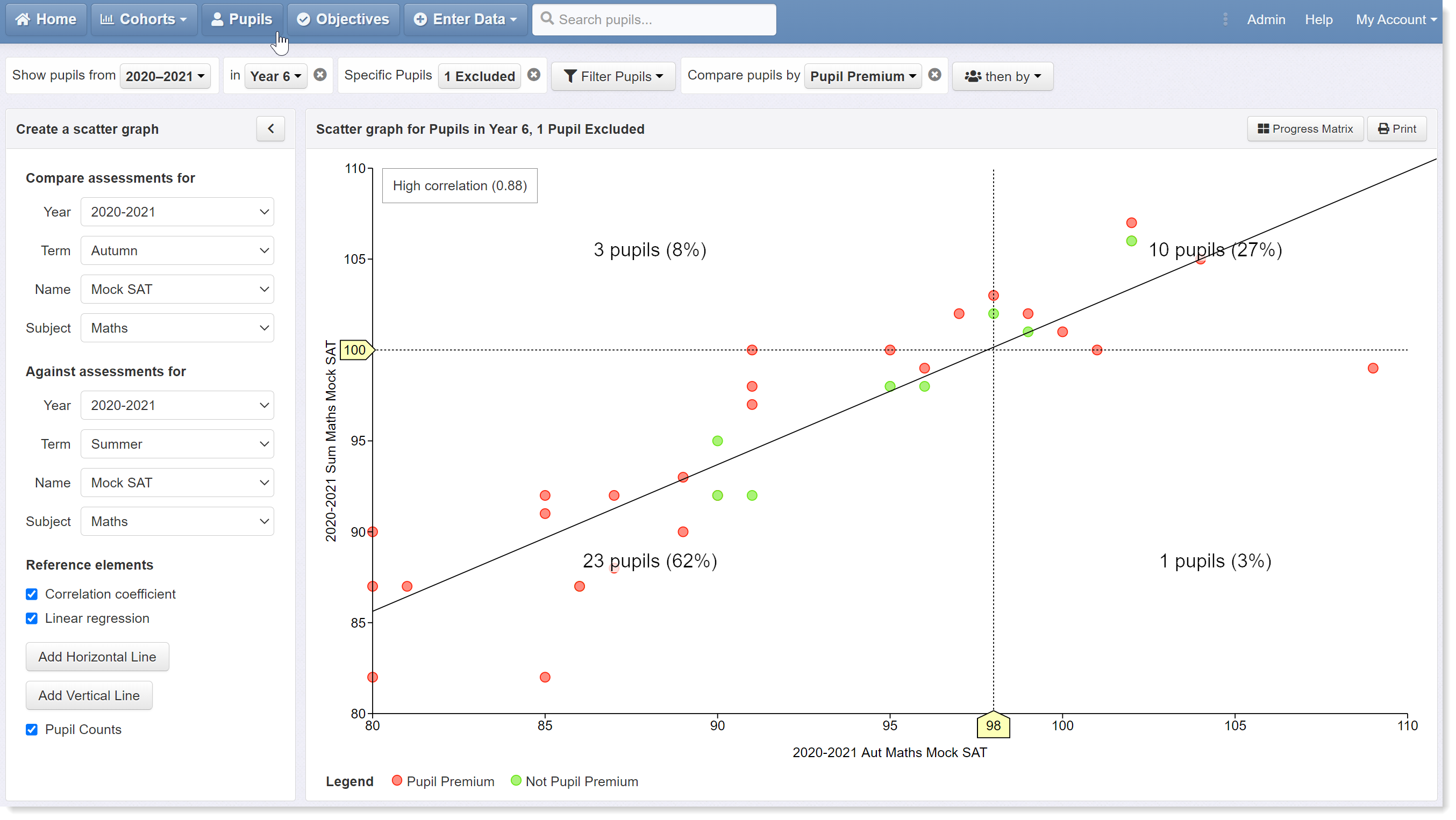
We now have a series of rising thresholds for the various practice tests taken across year 6 that we can use as indicators of expected standards:
- Reading beginning of year - 94
- Reading end of autumn term - 97
- Maths beginning of year - 95
- Maths end of autumn term - 98
We hope this help guide has been useful and given you some good ideas for using scatter graphs. Please get in touch if you need any help with scatter graphs, setting up thresholds, or anything else.