Scatter Graphs - Introduction
 Updated
Most of the time, when comparing broad and discrete data such as teacher assessments, a progress matrix will suffice. But what if we want to compare more granular data such as test scores? A progress matrix can do it, by categorising scores within defined ranges, but a scatter graph does a better job.
Coming Soon - For Trust users, there is also a Scatter Graph report showing data for all the schools in the Trust.
In this help guide we'll have a look at the scatter graph report and learn about its key functions, namely:
- Plotting results of various assessments
- Adding a regression line
- Adding reference lines
- Grouping pupils
- Interpreting correlation
Running the report
First, click on the Reports menu and select Scatter Graph.
Now let's select some data for our report. For this we need two sets of data, and in the example below we're using the results of consecutive Rising Stars reading tests taken at the end of last year and in the autumn term this year by the current Year 3 cohort.
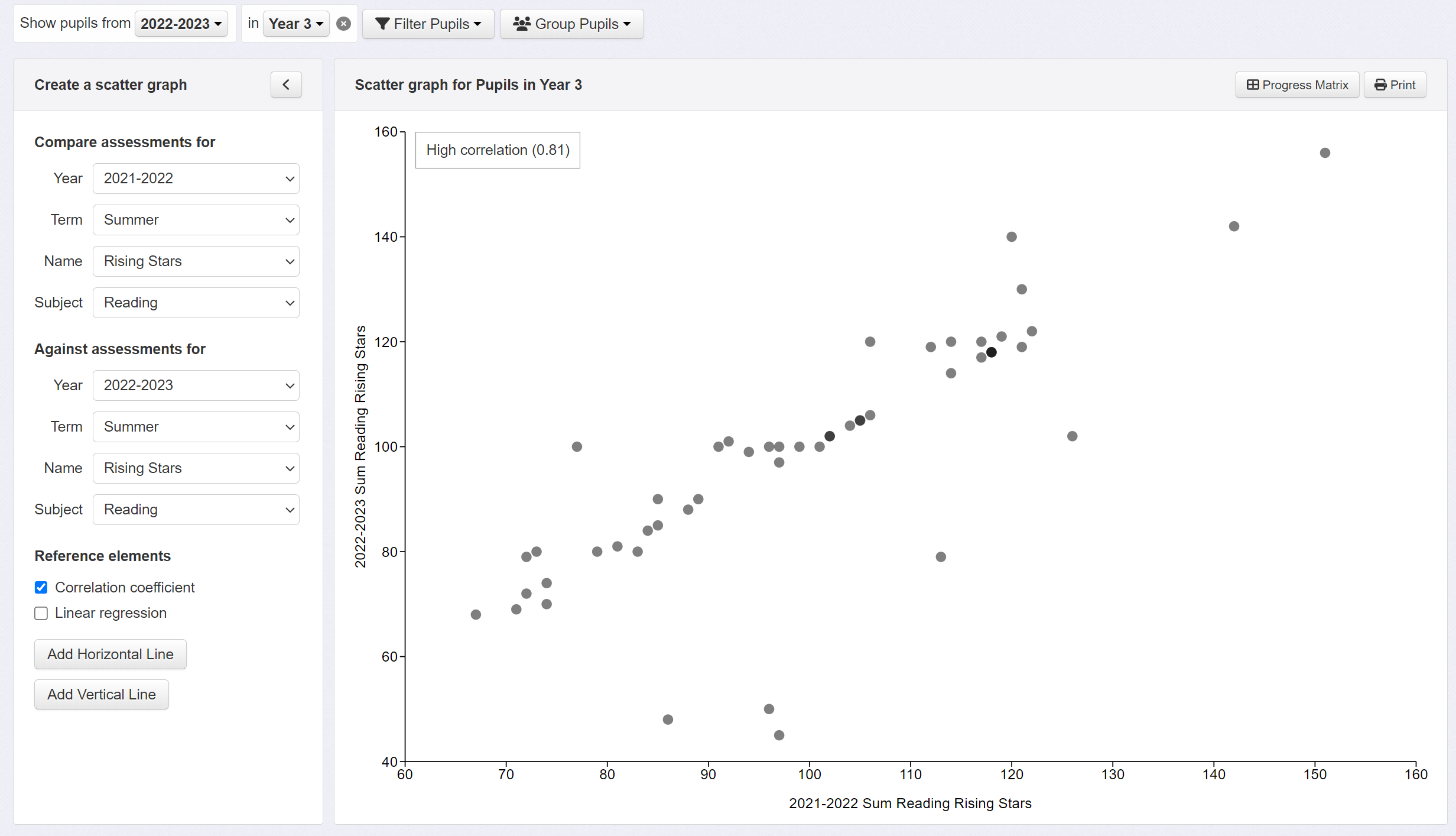
Correlation
We can see that there is some correlation between tests - generally speaking, higher scores on one test result in higher scores on the next - but we can add a linear regression line - a line of best fit - to our graph to aid interpretation. Click on the 'linear regression' option in the left hand panel.
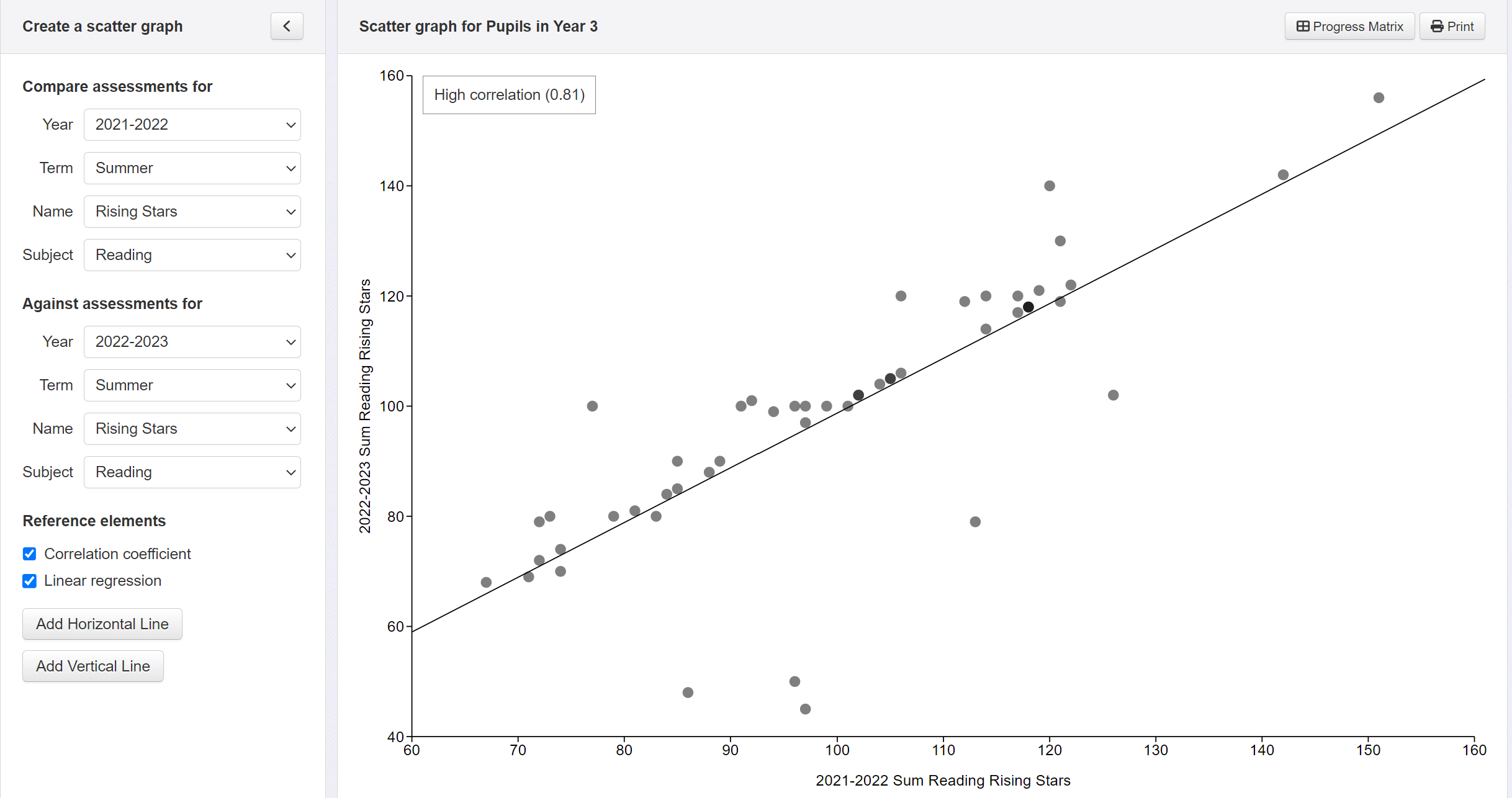
If correlation between the two data sets was high, we could use that line to help predict the likely outcomes on a future test from the results of a previous one. To give an idea of how well correlated your selected data sets are, Insight provides a correlation coefficient.
In Insight we categorise correlation as follows:
- 0.0-0.3: Very low
- 0.3-0.5: Low
- 0.5-0.7: Moderate
- 0.7-0.9: High
- 0.9-1.0: Very high
The graph above shows a high correlation (0.81) between last summer's reading test scores and those from this summer.
Reference Lines
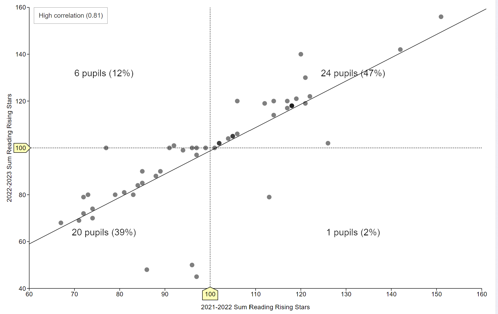
Having added a linear regression line, let's add some other reference lines to our scatter graph to help with our analysis of the data. Click on the Add Horizontal Line and Add Vertical Line buttons in the left hand control panel and drag the new lines to a suitable position along the axis. To position the reference lines, hover over them and a hand tool will appear - use this to click and drag them. A good place to start is to set them both to a value of 100, which is average on a standardised test.
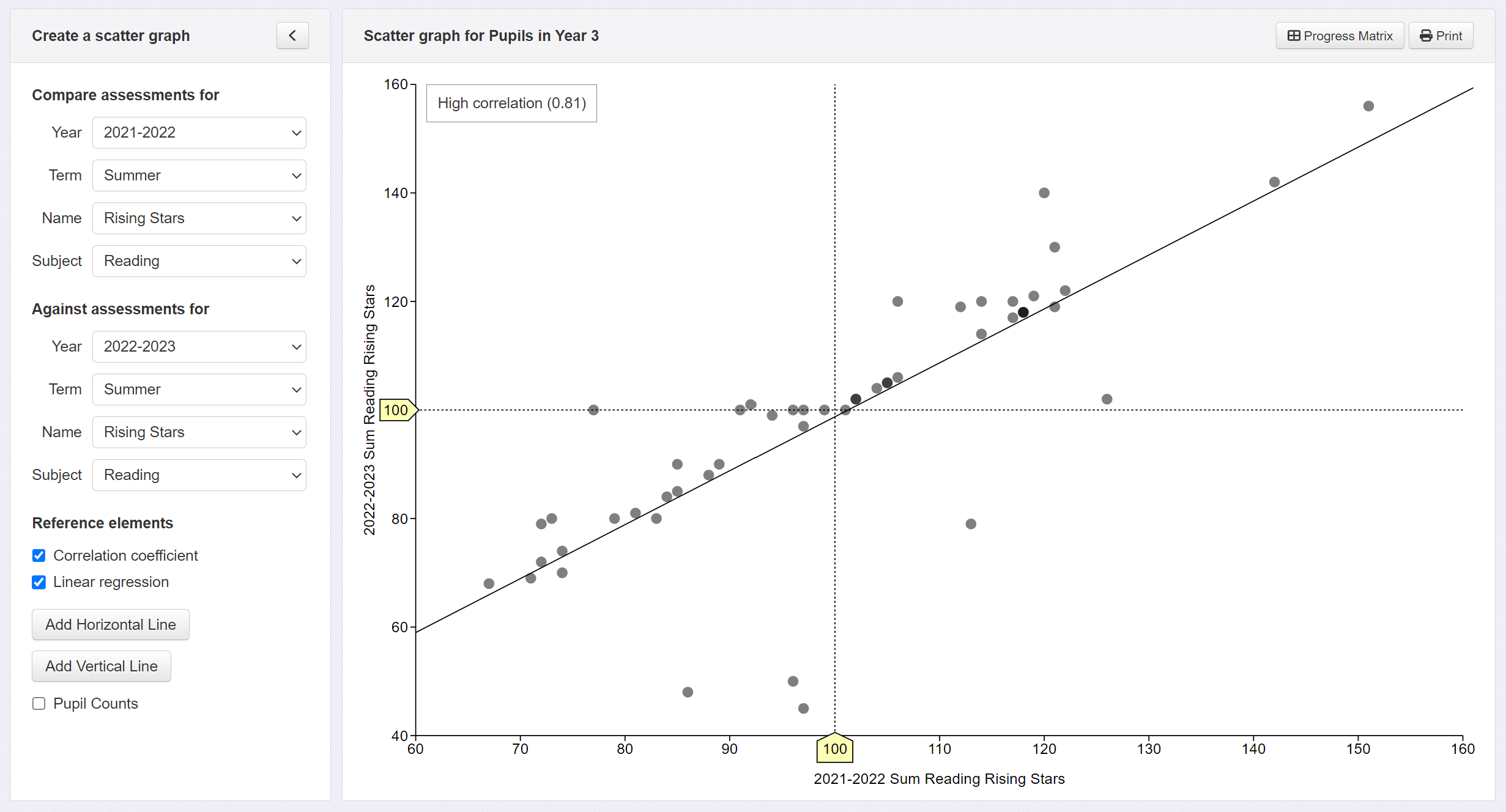
Now click on the Pupil Count button, also in the left hand control panel. This will calculate the number and percentage of pupils in each quadrant. As we can see below, 47% of pupils achieved average or better scores on both tests, and 39% achieved below average scores on both tests. But we also have 12% (6 pupils) that achieved below average scores on the first test and were at least average on the next; and 2% (1 pupil) that did the opposite.
Grouping Pupils
And finally, let's add another visual aid to our graph: pupil groups. Click on the Group Pupils button at the top of the Insight screen and select an option. Here, we've selected Pupil Premium. This will colour code the two groups so they can be easily identified.
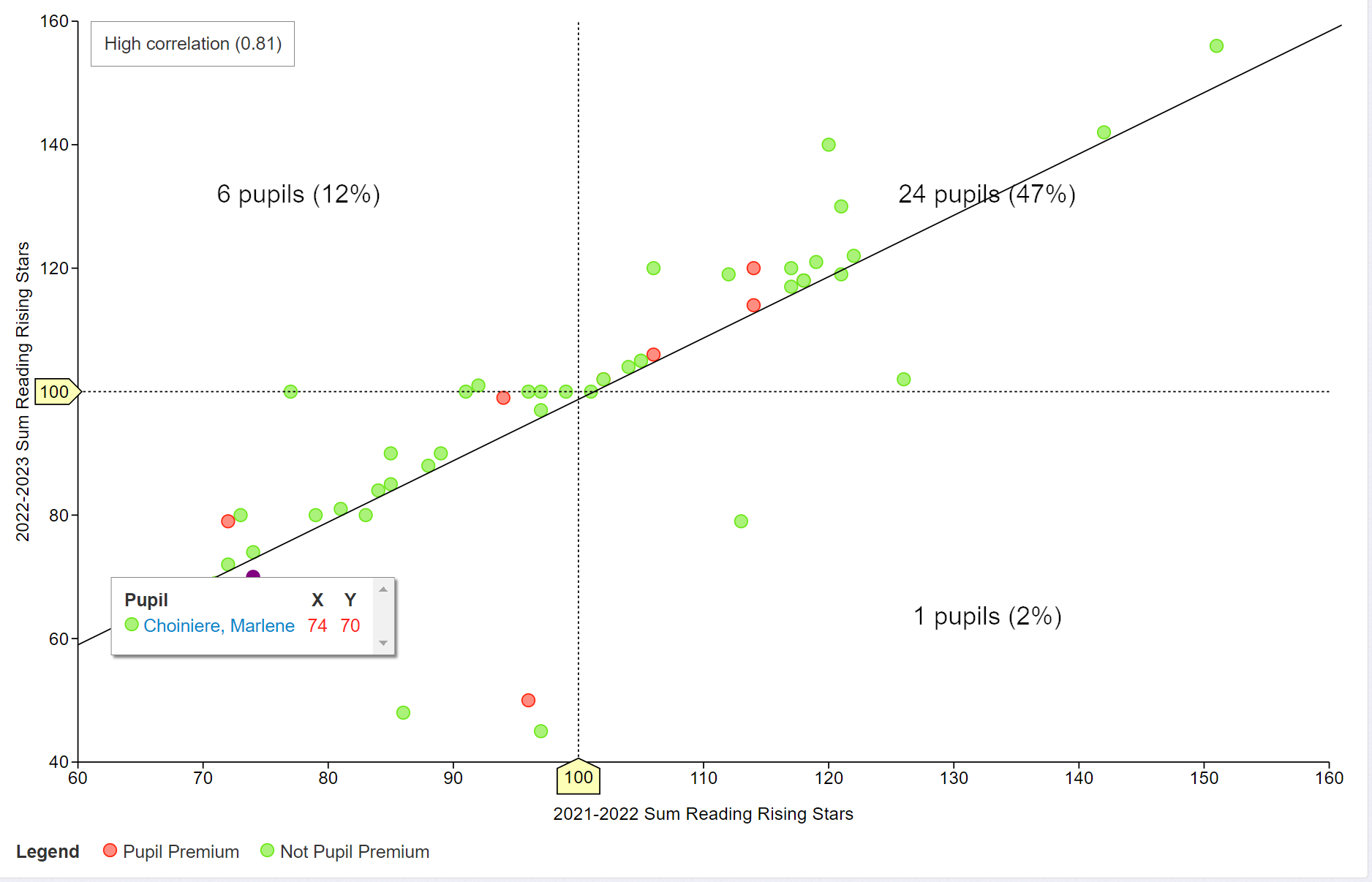
The graph clearly identifies the pupil premium pupils with a red dot and will help spot any issues relating to the pupils in that group.